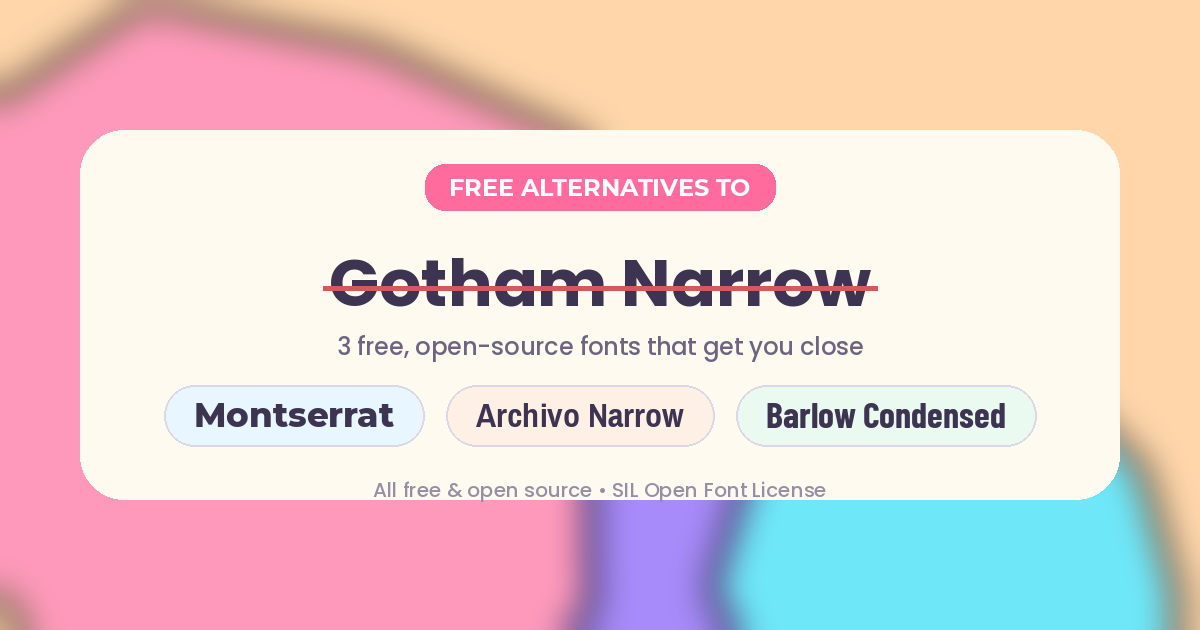
Gotham Narrow is one of Hoefler&Co's most useful width variants — a moderate compression of the original Gotham that sits between the standard width and the much tighter Gotham Condensed. It's a favorite for editorial layouts, dashboards, and branding systems that need to say more in less horizontal space without losing Gotham's clean, geometric warmth. The catch: like the rest of the Gotham family, it's a premium commercial font, and there's no free version or Google Fonts equivalent.
The good news is there are solid free alternatives that get you close, whether you want the geometric feel or the narrow proportions (or both).
About Gotham Narrow
- Foundry: Hoefler&Co
- Classification: Sans-serif, geometric
- Width: Falls between standard Gotham and Gotham Condensed — narrower than the base family, but gentler than a full condensed cut
- Best for: Editorial body text, UI navigation and data tables, brand systems that need multiple widths, and advertising copy where space is tight but readability still matters
Because it's a paid Hoefler&Co release, Gotham Narrow isn't available on Google Fonts or any other free font platform — so if you need the look without the license fee, you'll want one of the alternatives below.
The Closest Free Match: Montserrat
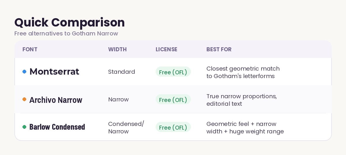
If you just want Gotham's overall geometric personality — the circular counters, the single-story a and g, the confident, architectural feel — Montserrat is the standard recommendation. It's not a narrow-width font on its own, but its proportions and letterforms are the nearest free match to Gotham's DNA, and it comes in nine weights plus italics, all free under the SIL Open Font License via Google Fonts.
For True Narrow Proportions: Archivo Narrow
When the narrow width itself is the priority — think dense UI tables or tight editorial columns — Archivo Narrow is a better structural match. It's a grotesque sans-serif built by Omnibus-Type, released under the OFL, and unlike some narrow Google Fonts it includes real italics, not just an oblique. It won't have Gotham's fully geometric bones, but the compressed proportions do the job Gotham Narrow was designed for.
A Geometric-Leaning Middle Ground: Barlow Condensed
Barlow Condensed splits the difference. It has a slightly more geometric, rounded character than Archivo Narrow, ships in a huge range of weights (Thin through Black, with italics), and is free under the OFL. It's a strong pick for branding systems that need one narrow-width family to cover everything from body copy to bold display headlines.
Where to Download
All three are available free through FontsGallery and Google Fonts, or as source files under the SIL Open Font License if you want to self-host them.