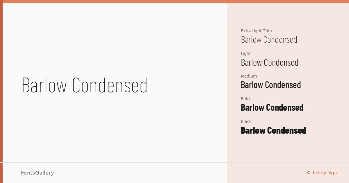
About Barlow Condensed Font
There is a discipline to these letterforms that you notice immediately — the compressed width, the low contrast, the way each stroke commits to its angle without fuss. Designed by Jeremy Tribby at Tribby Type, this is a condensed grotesque drawn with a clear industrial sensibility, one that keeps its cool even at display sizes.
Design Aesthetics & Character Characteristics
The family spans a full range of weights — Thin through Black — each paired with a matching italic, giving you eighteen styles in total. The mood runs from minimal and professional in the lighter cuts to genuinely bold in the heavier ones, without the forms ever becoming stiff or mechanical. That even tension across the range is what makes it useful for building hierarchies within a single piece of work. Files are delivered as TTF, with Latin and Vietnamese language support.
Recommended Usage & Font Pairing
This is a face built for headline and display work: posters, magazine covers, signage, and branding systems where a strong vertical rhythm needs to hold at large sizes. The condensed proportions stack well in tight editorial columns and identities where space is at a premium. It pairs naturally with contrasting textures — the editorial softness of Canela, the script warmth of Armelie, or the harder edge of 321 Impact and ABC Arizona; Kactigona brings another kind of contrast when something more decorative is needed alongside it.
License & Usage Terms
Released under the SIL Open Font License, Version 1.1, commercial use is permitted, and the font carries installable embedding rights — full terms are available at http://scripts.sil.org/OFL.