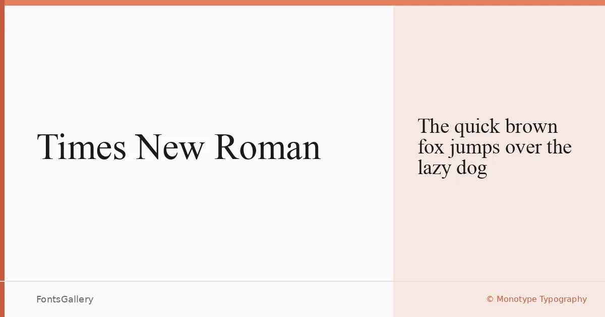
About Times New Roman Font
First cut in 1932 for the pages of The Times of London, this face was developed under Stanley Morison's direction with drawings by Victor Lardent, then refined further through Monotype's Type Drawing Office. The result drew on the character of old-style faces — experiments with Perpetua and Plantin informed the proportions — but sharpened everything in the service of legibility and economy on a newspaper column. The serifs are crisp, the stroke contrast deliberate, and the overall color on the page sits somewhere between warmth and authority.
Design Aesthetics & Character Characteristics
This is a classic serif with a professional, elegant presence that reads as composed rather than stiff — vintage in pedigree but not in feel. Only the Regular Normal is available here in TTF format, so you are working with a single weight, which rewards considered use rather than heavy typographic layering. The letterforms carry old-style DNA in their bracketed serifs and humanist axis, yet the proportions are tight enough that it holds up in headlines and compact editorial settings alike.
Recommended Usage & Font Pairing
It earns its place in book covers, magazine layouts, business cards, presentations, and headlines where a classical, professional tone is expected. Language coverage extends across Latin, Vietnamese, Cyrillic, Greek, Hebrew, and Arabic scripts, making it viable for genuinely multilingual publishing projects. For contrast pairings, it has been listed alongside Helvetica and Bahnschrift on the sans-serif side, and alongside Etna, Armelie, and Kactigona for display and decorative counterpoints.
License & Usage Terms
This family is offered under Personal Use terms — commercial use is not permitted, so confirm your rights with Monotype before deploying it in any client or commercial work. The license notes that use is limited to your own workstation for personal publishing, and copying or distributing the software is prohibited; embedding is set to installable.