About Bahnschrift Font
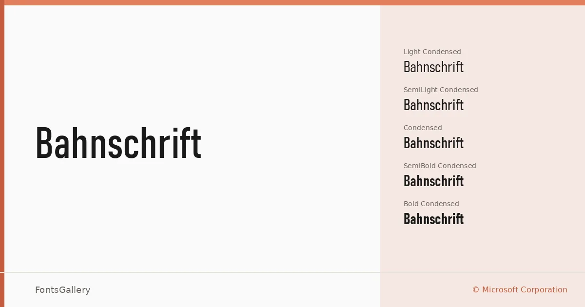
There is a particular crispness to the strokes here — clean terminals, consistent geometry, and a rational construction that reads immediately as northern European industrial sans. Designed by Aaron Bell for Microsoft Corporation, it arrives as an OTF variable font family with fifteen named styles spanning three widths and five weights.
Design Aesthetics & Character Characteristics
The family sits confidently in the modern, minimal end of the sans serif spectrum, carrying a professional weight without rigidity. The range runs from Light Light and Light Light Condensed at the airy end through Regular, SemiBold, and Bold — each available in standard, SemiCondensed, and Condensed widths — giving you a remarkably complete grid of options in a single family. The condensed cuts hold their geometry well at large sizes, which is exactly where this family wants to live: headlines, signage, and presentation decks where clarity and authority matter.
Recommended Usage & Font Pairing
The width range makes it genuinely useful across branding, advertising layouts, and wayfinding contexts where copy must fit a tight column without losing presence. Language coverage extends across Latin, Vietnamese, Cyrillic, and Greek, with partial Coptic support, so it handles multilingual headline work without substitution breaks. It pairs naturally with the editorial softness of Canela, the calligraphic warmth of Armelie, or the grid-heavy energy of 321 Impact; ABC Arizona and Kactigona offer contrasting texture when a layout needs more personality against its clean architecture.
License & Usage Terms
This font is released under a Personal Use license — a Microsoft-supplied font governed by the terms of the Microsoft product in which it was included — and commercial use is not permitted under these terms, so confirm your rights carefully before deploying it in a commercial job. Embedding is restricted to preview and print only.