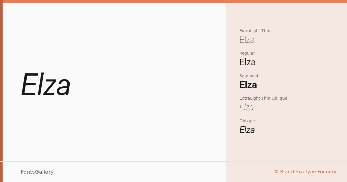
About Elza Font
There is a quiet authority to this sans serif from Daniel Sabino at Blackletra Type Foundry — the kind of geometry that does not need to announce itself. Letterforms sit with upright confidence, their proportions clean without feeling cold, and the stroke weight transitions across the range are handled with real care.
Design Aesthetics & Character Characteristics
The family spans Thin through Black, and each weight runs across four width axes — standard, Text, Narrow, and Condensed — with matching obliques throughout, giving you a disciplined system that holds together whether you are setting a single headline word or building a full typographic hierarchy. The Text subfamily is tuned for smaller sizes while the display widths, especially the Condensed and Narrow cuts, carry an elegant tension that reads as thoroughly modern. The overall mood lands somewhere between minimal and professional: nothing extraneous, nothing cold.
Recommended Usage & Font Pairing
The range of widths and weights makes this system well suited to branding identities, magazine layouts, website headers, and logo work where Latin-script copy needs to flex across different contexts without losing its voice. The condensed and black cuts are natural headline workhorses; the lighter text weights settle quietly into body-adjacent roles. It pairs with contrasting serifs and script faces — Canela, Times New Roman, and Armelie each offer a different kind of counterpoint, while Angeletta and Minecraft pull it into more expressive territory.
License & Usage Terms
These files are offered under a Demo license, which covers personal and trial use only — confirm licensing terms with Blackletra Type Foundry before applying this family to any commercial job. Embedding is permitted as editable.