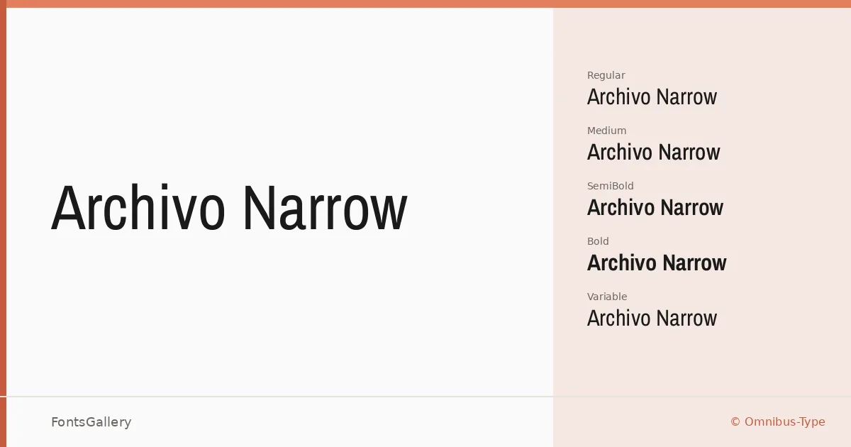
About Archivo Narrow Font
There is a quiet efficiency to these letterforms — compressed without feeling squeezed, neutral without losing personality. Hector Gatti at Omnibus-Type built this family with both print and digital environments in mind, and the result is a sans serif that holds its composure under real working conditions. The spacing and stroke weights have been calibrated for high-performance typography rather than decorative effect.
Design Aesthetics & Character Characteristics
The family sits firmly in the modern, professional end of the sans serif spectrum — minimal in detail, confident in weight. Styles run from Regular and Italic through Medium, SemiBold, and Bold, each with a companion italic, plus variable and variable italic fonts that let you move freely across the weight range. The narrow proportions make it particularly useful when column width is tight or when a headline needs to stay on one line without compromise. All files are delivered in TTF format.
Recommended Usage & Font Pairing
It earns its keep in branding, magazine layouts, presentation decks, and website headers — anywhere that demands a clean, professional voice at display sizes or in body columns where space is at a premium. Latin and partial Latin Extended coverage is supplemented by Vietnamese, which broadens its reach across multilingual editorial and digital work. It pairs well with the editorial softness of Canela, the script warmth of Armelie, the display aggression of 321 Impact, the refined geometry of ABC Arizona, or the structured personality of Kactigona.
License & Usage Terms
Archivo Narrow is released under the SIL Open Font License, Version 1.1, which permits commercial use — details and the full FAQ are available at https://scripts.sil.org/OFL. Embedding is set to installable, so you can distribute it inside documents and applications without restriction.