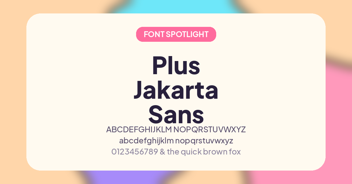
If you've ever specced Neuzeit Grotesk for a project and then hit a licensing wall, you're not alone. It's a beautiful geometric grotesque, but it's a paid, proprietary typeface — not something you can just drop into a client site or a personal project without a license fee. Enter Plus Jakarta Sans, a free and open-source sans-serif that draws direct inspiration from Neuzeit Grotesk and delivers a strikingly similar feel, with none of the licensing friction.
Where It Comes From
Plus Jakarta Sans was designed by Gumpita Rahayu of Tokotype, originally commissioned by 6616 Studio for the Jakarta Provincial Government's "+Jakarta: City of Collaboration" identity program in 2020. The brief called for a typeface that could represent a modern, diverse, collaborative city — and the result was a geometric sans that pulls from Neuzeit Grotesk, Futura, and other 1930s-era grotesques, blending their near-monoline structure and pointed curves into something distinctly contemporary. It was released under the SIL Open Font License, meaning you can use it freely in commercial and personal projects, print or digital, no royalties required.
What Makes It a Good Neuzeit Grotesk Substitute

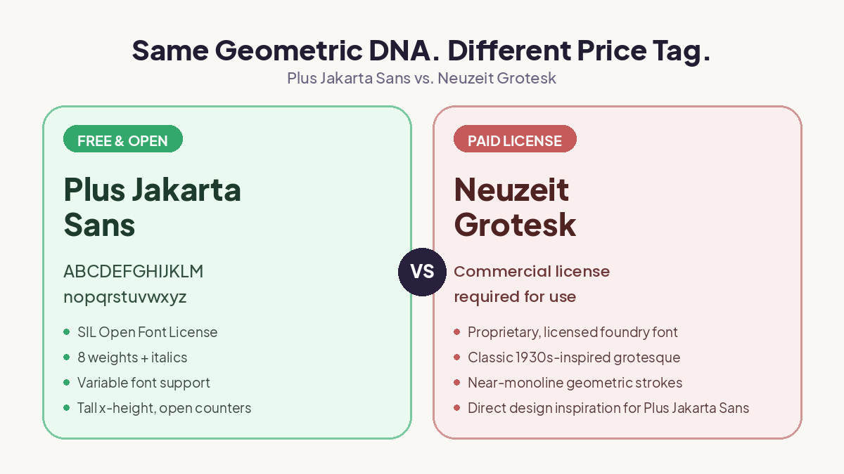
The resemblance isn't accidental — the designer named Neuzeit Grotesk as a direct reference point. A few shared traits:
- Geometric bones with warmth. Like Neuzeit Grotesk, Plus Jakarta Sans is built on clean geometric forms but avoids feeling cold or mechanical, thanks to slightly softened curves.
- Tall x-height. The x-height is intentionally generous, which keeps lowercase text legible and gives headlines a confident, modern presence — a quality Neuzeit Grotesk is also known for.
- Open counters and even spacing. Both typefaces prioritize legibility at a range of sizes, from small UI text to large display headlines.
- Wide weight range. Plus Jakarta Sans ships in eight weights (ExtraLight through ExtraBold) plus matching italics, and it's available as a variable font — so you get the same flexibility you'd expect from a professional grotesque family.
Technical Details
- Format: Variable font (weight axis 200–800), with static instances also available
- Styles: 8 weights × upright and italic = 16 total styles
- Language support: Latin, Cyrillic, and Vietnamese character sets
- License: SIL Open Font License — free for commercial and personal use
- Extras: Three stylistic alternate sets (Lancip/Sharp, Lurus/Straight, Lingkar/Swirl) for subtle character variation in select glyphs
Where to Use It
Because of its tall x-height and clean geometry, Plus Jakarta Sans works especially well for:
- SaaS and product UI (it's become a popular choice in design systems)
- Startup and tech branding
- Editorial headlines paired with a serif body font
- Anywhere you'd have reached for Neuzeit Grotesk but needed a free, embeddable, self-hosted option
Where to Download
Plus Jakarta Sans is available free through Google Fonts or from fontsgallery, or even you can grab the source files directly from the Tokotype GitHub repository if you want the variable font or need to dig into the OpenType feature sets.