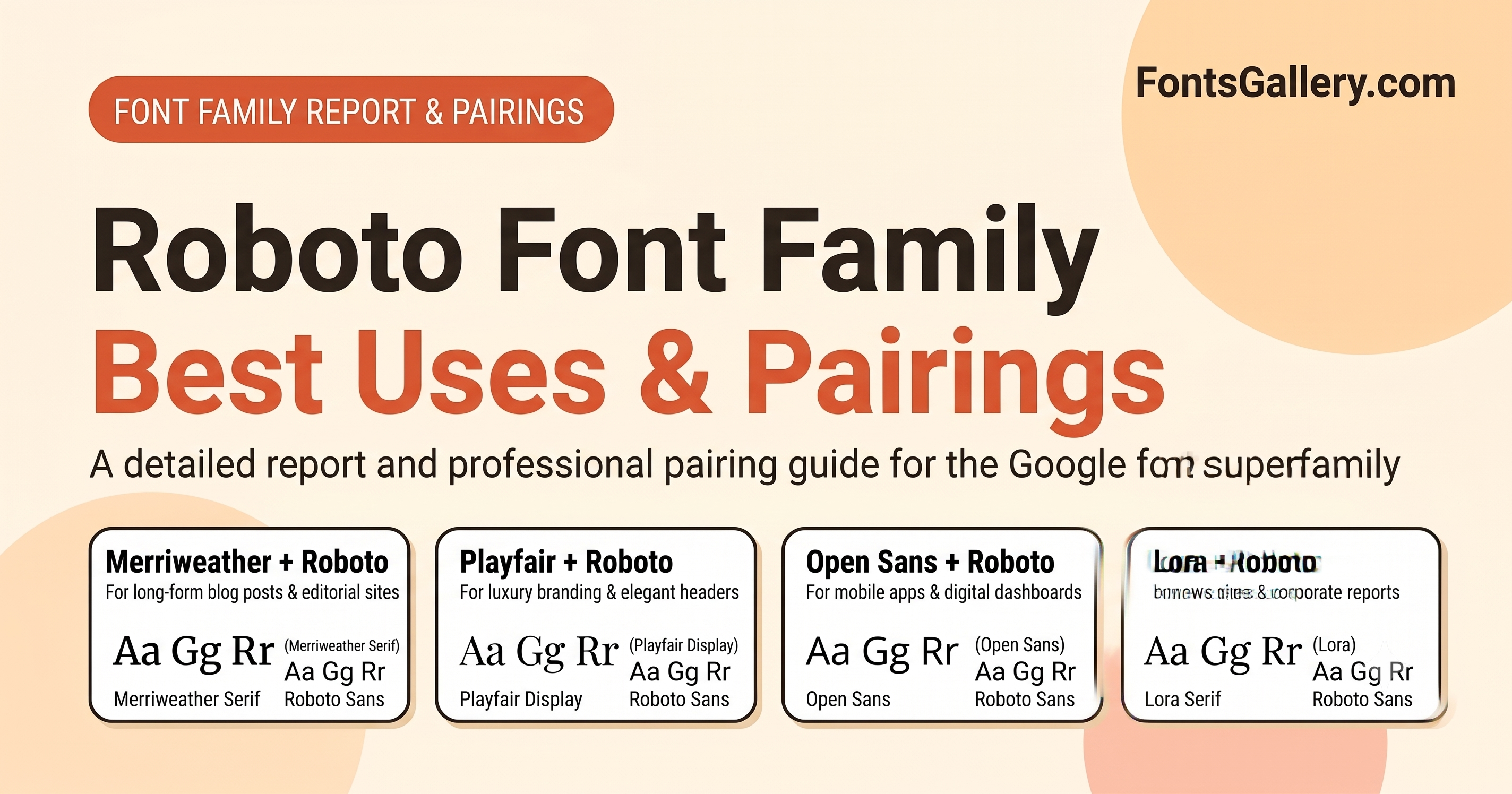
If you have used an Android phone, navigated with Google Maps, or browsed YouTube, you have been reading Roboto. Introduced in 2011, this neo-grotesque sans-serif has quietly become one of the most widely used typefaces in the world. Here is a comprehensive look at the Roboto font family, its best uses, why it dominates modern UI design, and how to pair it effectively.
Why is Roboto So Popular?
Roboto’s ubiquity is not just because it is the default font for Google’s massive ecosystem. It earned its place as a designer favorite through a clever balance of mechanics and humanism.
- The "Dual Nature" Design: Roboto was designed with a "mechanical skeleton" featuring largely geometric forms. However, it doesn't force letters into a rigid rhythm. Instead, it incorporates friendly, open curves, allowing letters to settle into their natural width.
- Exceptional Screen Legibility: Designed specifically for the smartphone era, Roboto features a tall x-height. This ensures outstanding readability across all screen sizes and resolutions, from tiny smartwatches to massive 4K monitors.
- Neutral Yet Approachable: While many geometric sans-serifs can feel cold or clinical, Roboto’s slightly rounded details give it a warm, approachable vibe. It communicates clarity without sacrificing personality.
- Open Source Freedom: Licensed under the Apache License, Roboto is completely free for both personal and commercial use, making it incredibly accessible for developers and designers globally.
Best Uses for Roboto
Roboto is a versatile workhorse that fits seamlessly into a wide variety of design contexts:
- Mobile App & UI Design: As the cornerstone of Google’s Material Design system, Roboto is practically tailor-made for digital interfaces, buttons, navigation menus, and data-heavy dashboards.
- Tech & Startup Branding: Its clean, modern lines make it a go-to choice for technology companies and minimalist brands aiming to convey innovation, speed, and precision.
- Editorial Web Content: Because it allows for a natural reading rhythm, it works beautifully for long-form reading on the web, especially when used for body copy.
- Corporate Presentations: Its professional yet friendly tone makes it an excellent choice for slide decks, financial reports, and marketing materials.
Detailed Report: The Roboto Typeface Family
1. History and Evolution
Commissioned by Google and designed by Christian Robertson, Roboto was first released in 2011 as the system font for Android 4.0 "Ice Cream Sandwich," replacing the older Droid font family. In 2014, alongside the rollout of Google’s "Material Design" language, Roboto underwent a significant redesign. The letters were refined to be slightly wider, rounder, and more open, optimizing them further for high-density screens.
2. The Superfamily (Variations)
Roboto is no longer just a single font; it is a massive "superfamily" offering tools for almost any typographic need:
- Roboto Sans: The core sans-serif family, available in weights ranging from Thin (100) to Black (900), complete with matching italics.
- Roboto Condensed: A narrower version designed for tight spaces, mobile interfaces, and data-dense environments.
- Roboto Mono (2015): A monospaced variant perfect for coding, tabular data, and technical documentation.
- Roboto Slab (2013): A slab-serif companion. It retains the core proportions of Roboto but adds sturdy, blocky serifs for impact, often used in headlines.
- Roboto Serif (2022): Designed by Greg Gazdowicz, this is a highly readable, retro-styled serif drawn from scratch to perfectly match Roboto Sans's vertical proportions.
- Roboto Flex: A massive variable font featuring 12 adjustable axes (including weight, width, optical size, slant, and more), allowing designers to finely tune the font to their exact specifications.
3. Global Language Support
To support Google’s global user base, Roboto supports Latin, Greek, and Cyrillic characters natively. It also seamlessly pairs with Google's Noto font family to cover virtually every written language in the world.
Best Pairings & Their Uses
Because Roboto is a neo-grotesque sans-serif, it pairs wonderfully with character-rich serifs or highly geometric sans-serifs. Here are the best combinations and where to use them:
Best Use: Blogs, Editorial Sites, and Online Magazines
Merriweather was designed to be highly readable on screens. Its traditional, slightly bulky serif style provides a beautiful, classic contrast to Roboto’s modern, clean lines.
Best Use: Luxury Brands, Portfolios, and Lifestyle Websites
Playfair Display is a high-contrast transition serif that exudes elegance. Pairing it with Roboto grounds the design, ensuring that the luxurious headings are balanced by highly legible, modern body text.
Best Use: Corporate Reports, News Outlets, and Whitepapers
Lora has brushed curves and driving serifs that give it a contemporary yet authoritative feel. When paired with Roboto, it creates a trustworthy, highly professional aesthetic perfect for serious content.
Best Use: SaaS Platforms, Dashboards, and Web Applications
If you want an entirely sans-serif layout, this is a classic. Using a heavier weight of Roboto for headings gives the UI structure, while the slightly wider and very friendly Open Sans makes reading long paragraphs of UI instructions a breeze.