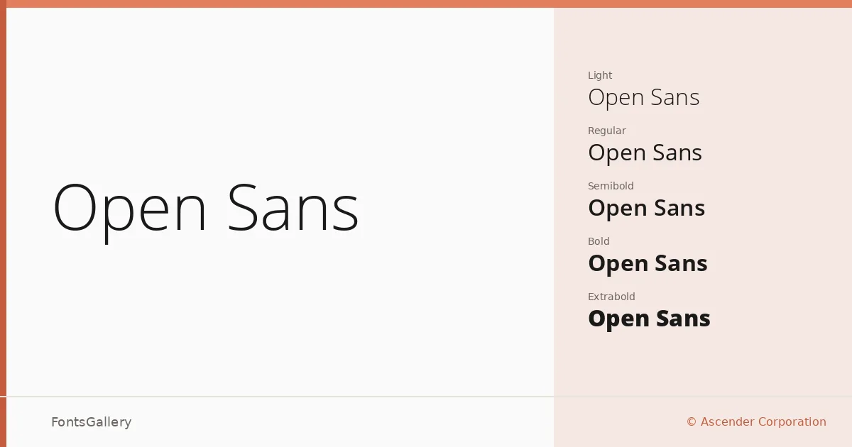
About Open Sans Font
There is a particular kind of quiet confidence in a sans-serif that manages to disappear into the content it carries — and that is exactly what Steve Matteson achieved here for Ascender Corporation. Drawn with an upright, humanist structure, the letterforms are open, with generous apertures and proportions that keep text readable at nearly any size. The copyright sits with Google Corporation, which distributed the family widely, though the design work itself is Matteson's.
Design Aesthetics & Character Characteristics
The family runs from Light through ExtraBold — ten cuts in total, each paired with a corresponding italic: Light, Light Italic, Regular, Italic, Semibold, Semibold Italic, Bold, Bold Italic, Extrabold, and Extrabold Italic. That range gives you genuine flexibility across weight hierarchies without the forms ever becoming mannered or self-conscious. The overall character is classic and minimal, with a professional cleanliness that never tips into coldness — the humanist skeleton keeps it warm enough to read comfortably at length. All files ship as TTF.
Recommended Usage & Font Pairing
The breadth of the weight range makes it well suited to branding systems, business cards, magazine layouts, and presentation decks, while the open construction holds up reliably in website headers at display sizes. Language coverage spans Latin, Vietnamese, Cyrillic, and Greek, which makes it a practical choice wherever copy crosses those scripts. Among named pairings, it works well alongside Canela, Armelie, 321 Impact, ABC Arizona, and Kactigona — any of which can introduce contrast in texture or personality where the neutrality of this family is doing structural work.
License & Usage Terms
Released under the Apache License, Version 2.0, this family allows commercial use and carries editable embedding permissions — full terms are available at http://www.apache.org/licenses/LICENSE-2.0.