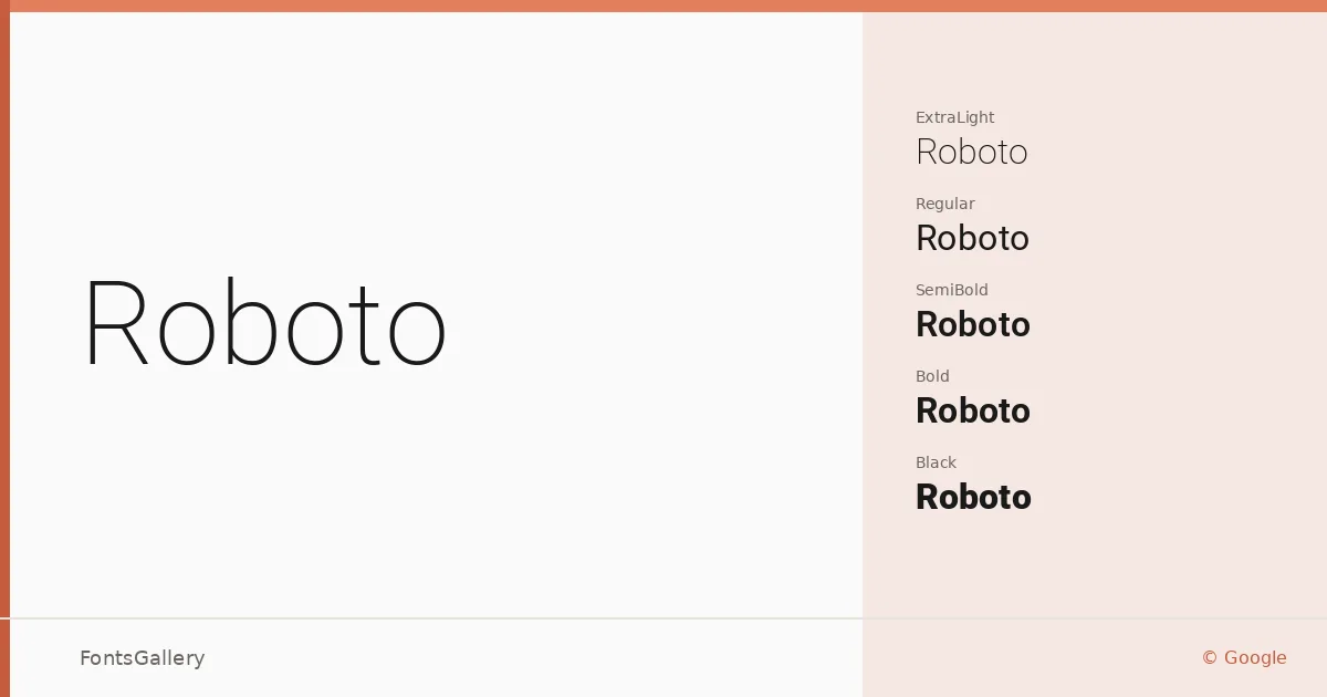
About Roboto Font
Christian Robertson's design for Google achieves something genuinely difficult: a geometric sans-serif that still reads warmly at body sizes. The letterforms carry open apertures and friendly terminals while maintaining the mechanical regularity you expect from a screen-first workhorse. Copyright rests with The Roboto Project Authors, and the family has been maintained as an open-source effort from the start.
Design Aesthetics & Character Characteristics
The family spans an unusually wide range — from Thin through Black, across upright and italic cuts, in Regular, SemiCondensed, and Condensed widths, plus variable font files — all delivered in TTF format. That width axis is where the family earns its keep: the condensed cuts compress cleanly without the distortion you see in mechanically squeezed type, and the semi-condensed sits in a sweet spot for tight column grids. The overall mood is minimal and modern without being cold, professional without being rigid.
Recommended Usage & Font Pairing
The range of widths and weights makes it a natural fit for website headers, editorial layouts, business cards, and branded presentation decks where hierarchy needs to be built from within a single family. Language coverage spans Latin, Vietnamese, Cyrillic, and Greek, so it holds together across multilingual projects without swapping faces. For contrast pairings, it has been matched with Canela, Armelie, 321 Impact, AQUA, and Kactigona — any of these can introduce texture against Roboto's measured neutrality.
License & Usage Terms
Released under the SIL Open Font License, Version 1.1 — commercial use is permitted, and the embedding permission is set to installable. Full license terms and FAQ are available at https://openfontlicense.org.