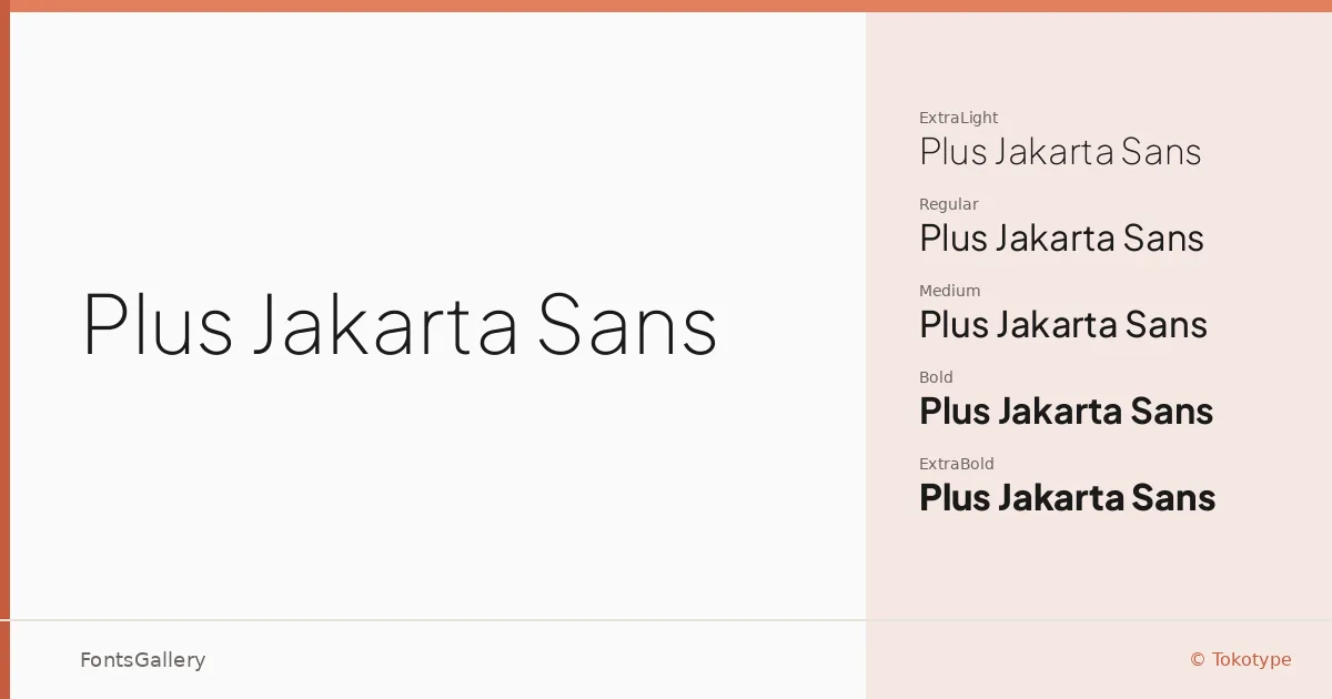
About Plus Jakarta Sans Font
Commissioned for Plus Jakarta City of Collaboration, this geometric sans-serif was drawn by Gumpita Rahayu at Tokotype. The letterforms carry a quiet confidence — open apertures, consistent stroke weights, and terminals that sit just far enough from neutral to give the face a warm edge without sacrificing restraint.
Design Aesthetics & Character Characteristics
The family spans ExtraLight through ExtraBold, each weight accompanied by a true italic, and the set also includes Variable and Variable Italic files for environments that can use them — all delivered as TTF. Running from barely-there text weights to a commanding ExtraBold, the range reads as classic and minimal in the lighter cuts, then shifts toward something more assertive as the weight climbs. The overall mood stays modern and professional throughout, which is harder to achieve across this many stops than it looks.
Recommended Usage & Font Pairing
The weight range makes it well-suited to branding systems, business cards, presentation decks, and website headers — anywhere you need a single family to carry both body rhythm and display punch. Latin and Vietnamese coverage means it can handle multilingual projects across those scripts without substitution. For contrast pairings, it has been matched with serif and expressive faces including Canela, ABC Arizona, Armelie, Kactigona, and 321 Impact.
License & Usage Terms
Released under the SIL Open Font License, Version 1.1, commercial use is permitted and the font may be embedded with installable permissions — full license terms are available at https://scripts.sil.org/OFL.