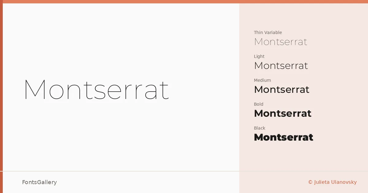
About Montserrat Font
The geometry here is clean but not cold — letters built on near-perfect curves and straight strokes that carry a quiet confidence at every size. Julieta Ulanovsky drew this sans serif family to capture the spirit of early twentieth-century signage and architecture in the Montserrat neighborhood of Buenos Aires, and that source material shows in the letterforms: humanist enough to be readable, geometric enough to feel purposeful. The family is available as TTF files and covers Latin, Latin Extended (partial), Vietnamese, and Cyrillic.
Design Aesthetics & Character Characteristics
The range runs from Thin Variable and Thin Variable Italic all the way through ExtraLight, Light, Regular, Medium, SemiBold, Bold, ExtraBold, and Black — each with a matching italic — giving you twenty cuts in total, plus variable axes for the two lightest styles. The mood sits at the intersection of minimal and modern: open counters keep text legible at small sizes, while the heavier weights carry enough mass to read as bold and professional at display scales without tipping into aggression.
Recommended Usage & Font Pairing
The family earns its place in branding, logo lockups, magazine layouts, and website headers — anywhere that asks for a neutral-but-distinctive sans that can anchor a hierarchy across many weights. For editorial contrast, it pairs well with Canela or ABC Arizona; Armelie and Kactigona offer more expressive counterpoints for packaging and identity work; and 321 Impact brings a heavier display option when you need maximum punch alongside it.
License & Usage Terms
Montserrat is released under the SIL Open Font License, Version 1.1, which allows commercial use freely; full terms and the accompanying FAQ are available at https://openfontlicense.org. Embedding is set to installable, so documents and applications can bundle the font without restriction.