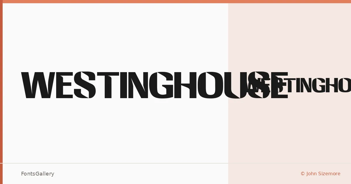
About Westinghouse Font
There is something deliberate about the way this single-weight design holds itself — each letterform drawn with enough personality to stand apart from the anonymous crowd of display faces. It comes from designer John Sizemore and ships as one style: Westinghouse Regular, in TTF format.
Design Aesthetics & Character Characteristics
With only the Regular cut in the family, the design lives or dies on the strength of its individual forms, and here they earn their keep. The weight feels considered rather than default, and the overall rhythm suggests a face that has been shaped by hand rather than assembled from modular parts. Partial Latin coverage means the character set covers the essentials without reaching into extended scripts.
Recommended Usage & Font Pairing
A single-weight face like this earns its place in headlines, logotypes, short editorial bursts, and anywhere the type needs to carry a distinct voice without competing weights to lean on. For body copy or secondary text, it pairs naturally alongside Helvetica for clean contrast, or alongside Canela when something warmer is needed. Armelie, Etna, and AQUA each offer their own counterpoint — the right choice depending on whether the surrounding layout calls for softness, structure, or energy.
License & Usage Terms
This family is available for commercial use, and the file embeds with editable permissions, making it straightforward to use in documents and digital layouts.