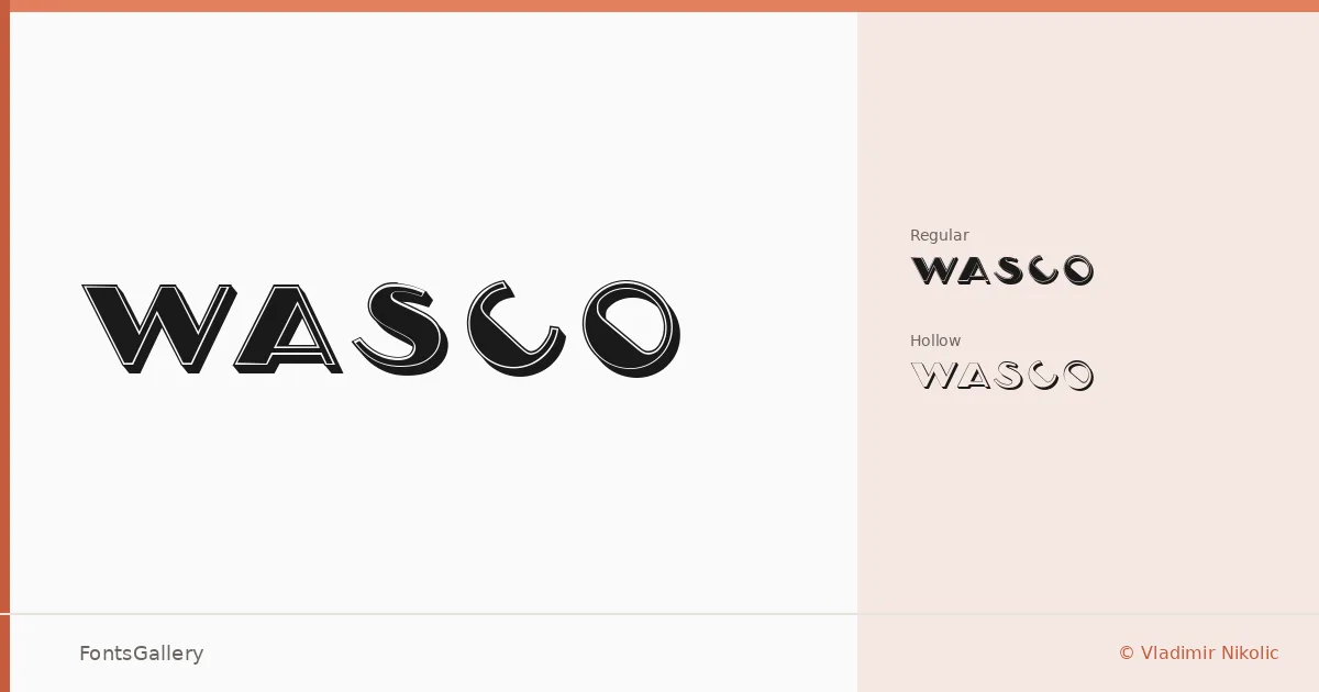
About Wasco Font
There is a deliberate confidence in these letterforms — the kind that suits a mark or a headline that needs to hold its ground at large sizes. Vladimir Nikolic designed both cuts in the family: Wasco Regular and Wasco Hollow Regular, the latter carrying the same structural weight as its companion but opened up with a hollow interior that adds a layer of graphic dimension without sacrificing legibility.
Design Aesthetics & Character Characteristics
This is a display family that sits at the crossroads of classic and modern, with a vintage undertone that keeps it from feeling sterile. The Regular brings a bold, solid presence, while the Hollow variant offers something slightly more editorial — the same letterform skeleton, rendered with a transparency that works especially well when printed large or reversed. Both cuts are available as TTF files.
Recommended Usage & Font Pairing
The family is well suited to branding work, poster compositions, logo lockups, and T-shirt graphics — anywhere a headline needs to carry visual authority on its own. For text support or contrast, the listed pairing options span a useful range: the neutrality of Helvetica, the editorial warmth of Canela, the contemporary geometry of ABC Arizona and Abrade, or the character of (AH) Manal, giving you plenty of directions to take a layout.
License & Usage Terms
Wasco is available under Personal Use terms only — confirm licensing with the designer before committing it to any commercial job. Embedding is permitted for preview and print only.