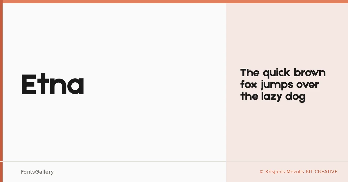
About Etna Font
There is a quiet confidence to this sans serif — the kind that comes from knowing exactly how much to strip away. Drawn by Krisjanis Mezulis of RIT CREATIVE, it arrives as a single Regular cut in OTF format, built around clean geometry and deliberate restraint. The letterforms carry both Latin and Cyrillic coverage, which broadens its reach considerably.
Design Aesthetics & Character Characteristics
Minimal and modern in disposition, Etna sits comfortably in the professional end of the sans serif spectrum. Its single weight punches with a boldness of intent rather than stroke thickness — the spacing feels considered, the proportions tight enough for headline use without becoming cramped. This is a face that trusts white space to do some of the work.
Recommended Usage & Font Pairing
It earns its place in branding systems, logo lockups, website headers, and business card treatments where clarity at a glance matters more than nuance at small sizes. For contrast, the listed pairings — Canela, Armelie, 321 Impact, ABC Arizona, and Kactigona — offer a range of options from editorial warmth to high-impact display, depending on the project's register.
License & Usage Terms
This family is released under Personal Use terms by Krisjanis Mezulis RIT CREATIVE, with no commercial use permitted and embedding restricted to preview and print only — confirm licensing with the designer before taking it into any commercial job.