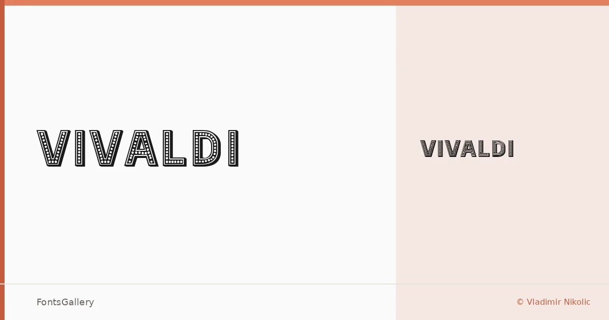
About Vivaldi Font
There is something deliberately theatrical about this single-weight display face — the kind of controlled drama you reach for when a headline needs to carry genuine authority. Designed by Vladimir Nikolic, it arrives as a single Regular cut, built for moments where one well-chosen weight is all the situation requires. The letterforms lean into a classic, vintage sensibility without feeling like a period piece.
Design Aesthetics & Character Characteristics
This is a display typeface in the truest sense: bold in presence, professional in finish, and carrying a vintage character that reads as earned rather than affected. The single Regular style is delivered as a TTF file, keeping implementation straightforward. In use, the forms project confidence — the kind that suits a brand mark or a poster headline rather than a running text column.
Recommended Usage & Font Pairing
The natural territory here is branding, advertising, logo work, and large-format headlines — jobs where the type needs to hold a room on its own. For contrast at body sizes or secondary hierarchy, the listed pairings cover a useful range: Etna and ABC Arizona bring their own editorial weight, Canela adds warmth, while Helvetica and Bahnschrift offer clean neutrality that lets the display character breathe.
License & Usage Terms
This family is offered under Personal Use terms, which means commercial use is not permitted — confirm licensing directly with Vladimir Nikolic before committing it to any client or revenue-generating work. Embedding is limited to preview and print only.