About Verve Font
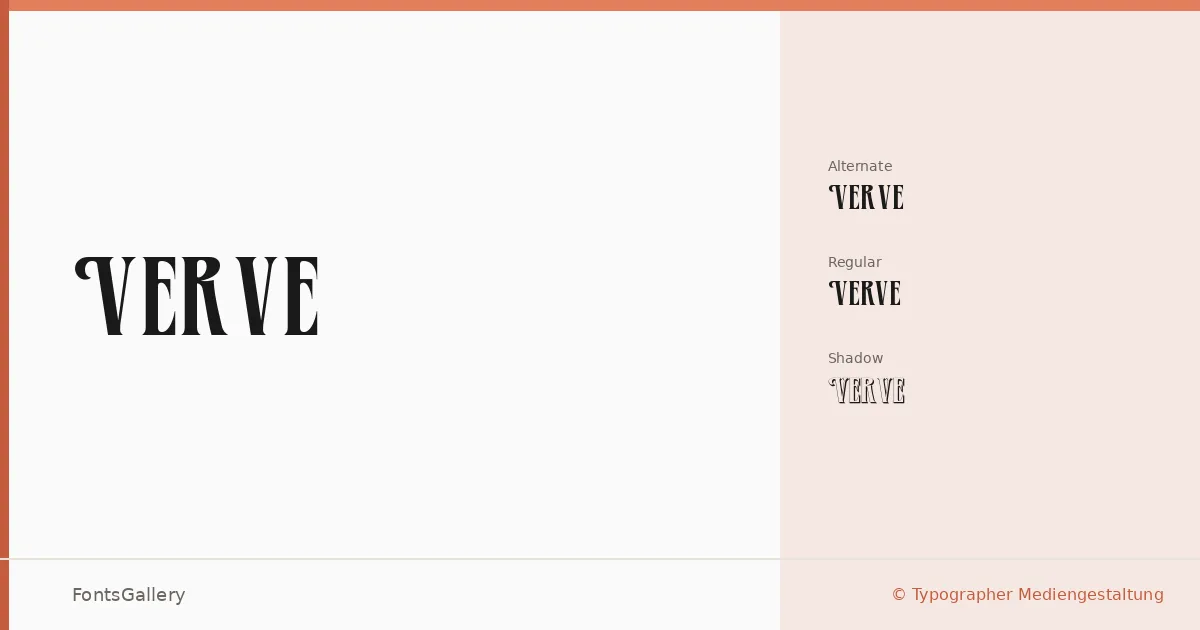
There is a confident theatrical weight to these letterforms — the kind of presence you expect from display type that was built for large settings. Released by Typographer Mediengestaltung, with the full character set completed by Dieter Steffmann, the family arrives in three distinct TTF files: a standard Regular, an Alternate cut that swaps in variant glyphs, and a Shadow companion that layers depth into the same structure.
Design Aesthetics & Character Characteristics
The mood sits squarely in bold, classic territory — elegant without being fragile, and vintage in the way that well-drawn display lettering from print traditions tends to be. Each of the three styles (Regular, Regular Alternate, and Regular Shadow) is built for Latin-script settings where a headline needs to hold the eye. The Alternate offers just enough variation in character shapes to shift the tone slightly, while the Shadow variant does exactly what its name suggests, giving the same skeleton a dimensional finish suited to poster work.
Recommended Usage & Font Pairing
The family earns its keep in branding and logo contexts where a vintage or classic register is deliberate, and in editorial work — magazine covers, feature headlines, event posters — where the letterforms need to carry weight at display sizes. For body copy or secondary text, pairing it against a clean neutral like Helvetica or Aileron keeps the hierarchy clear, while faces such as Aranea, Aresink, or Alexandria can complement it when a project calls for something with more character at smaller scales.
License & Usage Terms
This family is available for commercial use under its stated terms, and the fonts carry installable embedding permissions, meaning they can be embedded in documents without restriction.