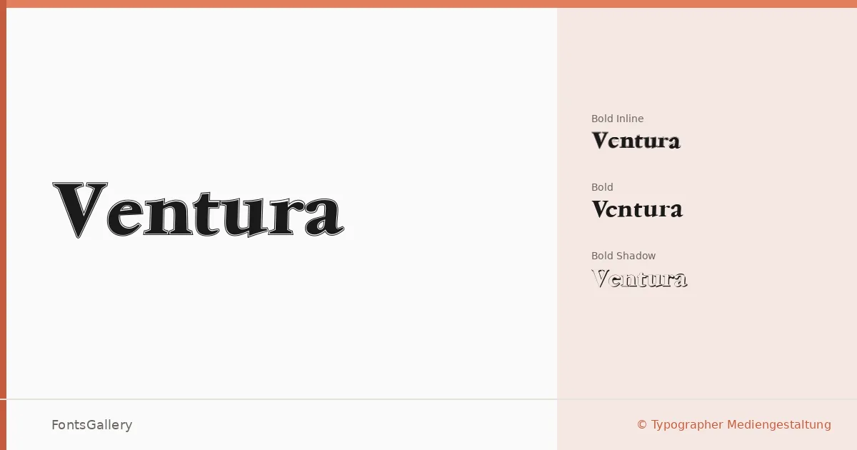
About Ventura Font
Three cuts, each carrying a distinct personality — a clean Bold, a stroked Inline Bold, and a Shadow Bold that adds immediate depth — make up this display family from Typographer Mediengestaltung. The letterforms lean into a classic, elegant register without tipping into nostalgia for its own sake. There is real weight and deliberateness here, the kind of confidence you expect from type built for large sizes.
Design Aesthetics & Character Characteristics
Ventura sits firmly in the display category, with a mood that reads as bold and vintage without losing its composure. The three styles — Ventura Bold, Ventura Inline Bold, and Ventura Shadow Bold — work as a layered system: the plain Bold anchors headlines cleanly, the Inline variant opens up the counters for a more decorative effect, and the Shadow cut gives layouts a sense of dimension that suits large-format work. All three are delivered as TTF files with installable embedding permissions, so they travel well from design file to finished document.
Recommended Usage & Font Pairing
The family earns its keep in branding, poster work, magazine headlines, and logo lockups where Latin-script coverage is sufficient. The shadow and inline cuts especially reward generous tracking at display scale. For body copy or secondary text, it pairs well with the neutrality of Helvetica or the warmth of Asap, while Canela, Etna, and AQUA each offer different levels of contrast for editorial and identity contexts.
License & Usage Terms
This family is available for commercial use, with installable embedding included in the license terms.