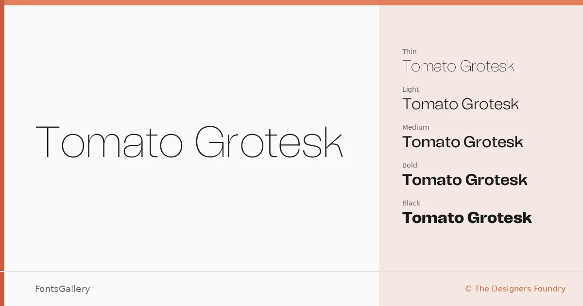
About Tomato Grotesk Font
There is a quiet confidence to this grotesque — a clean horizontality in the strokes that sits somewhere between the warmth of mid-century European sans-serifs and the crispness of contemporary geometry. Designed by Andrea Biggio and released through The Designers Foundry, it arrives in OTF format across an expansive range of eighteen styles: Thin through Black, each paired with a corresponding Slanted cut.
Design Aesthetics & Character Characteristics
The family reads as minimal and professional without feeling cold — the kind of grotesk that holds together at display sizes without losing composure in body text. Spanning nine weights from Thin to Black, with a true slanted companion at every step, it gives art directors genuine tonal range within a single coherent system. The slanted cuts carry genuine energy rather than the mechanical tilt of an auto-oblique, making them useful for contrast and hierarchy rather than just decoration.
Recommended Usage & Font Pairing
The weight range and classical modern character make it a strong candidate for branding systems, editorial magazine layouts, poster work, website headers, and business card design — anywhere Latin-script setting demands both presence and restraint at once. It pairs well with the editorial softness of Canela, the calligraphic flow of Armelie, the display energy of Urban Thunder Demo, the geometric clarity of AQUA, and the structural personality of Kactigona.
License & Usage Terms
This family is offered under a Personal Use license — commercial use is not permitted under these terms, so confirm licensing directly with The Designers Foundry before committing it to any client or commercial work. Embedding is permitted at the editable level.