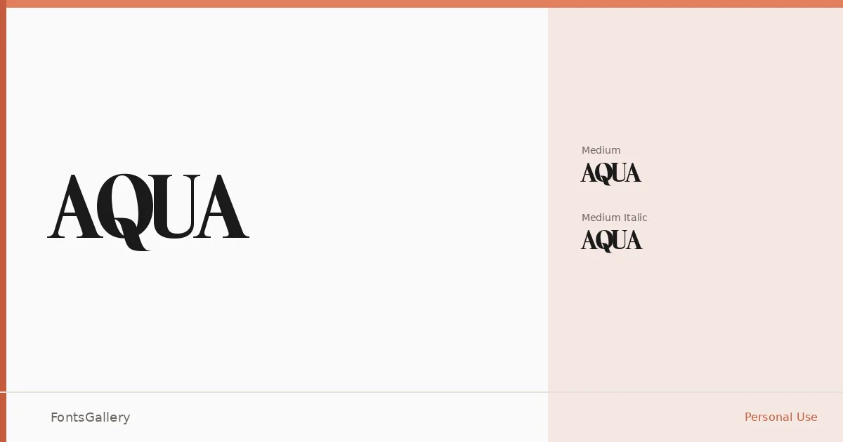
About AQUA Font
There is a particular kind of confidence in a serif that doesn't oversell itself — clean bracketing, measured contrast, and letterforms that hold their composure at display sizes without feeling stiff. This family arrives in two cuts: a Medium Regular and a Medium Italic, both delivered as TTF files.
Design Aesthetics & Character Characteristics
The mood here sits at the intersection of classic structure and modern restraint — the kind of serif that reads as luxury without resorting to excessive ornamentation. The italic is a genuine companion to the upright, leaning with enough personality to carry a pull quote or a logotype subline, while the regular holds the weight of a headline without effort. Together they carry an elegant, composed tone that suits editorial and identity work equally.
Recommended Usage & Font Pairing
This family earns its place in branding systems, magazine layouts, poster headlines, and website headers where the type needs to establish authority at a glance. For pairings, the listed companions span a useful range: Helvetica and Aileron bring a clean sans contrast, while Ballmain, Abrade, and Batoshi offer more character-driven alternatives depending on how much warmth or edge the project calls for.
License & Usage Terms
This family is available under Personal Use terms — commercial use is not permitted, so confirm licensing arrangements before taking it into a client or commercial job. Embedding is set to installable.