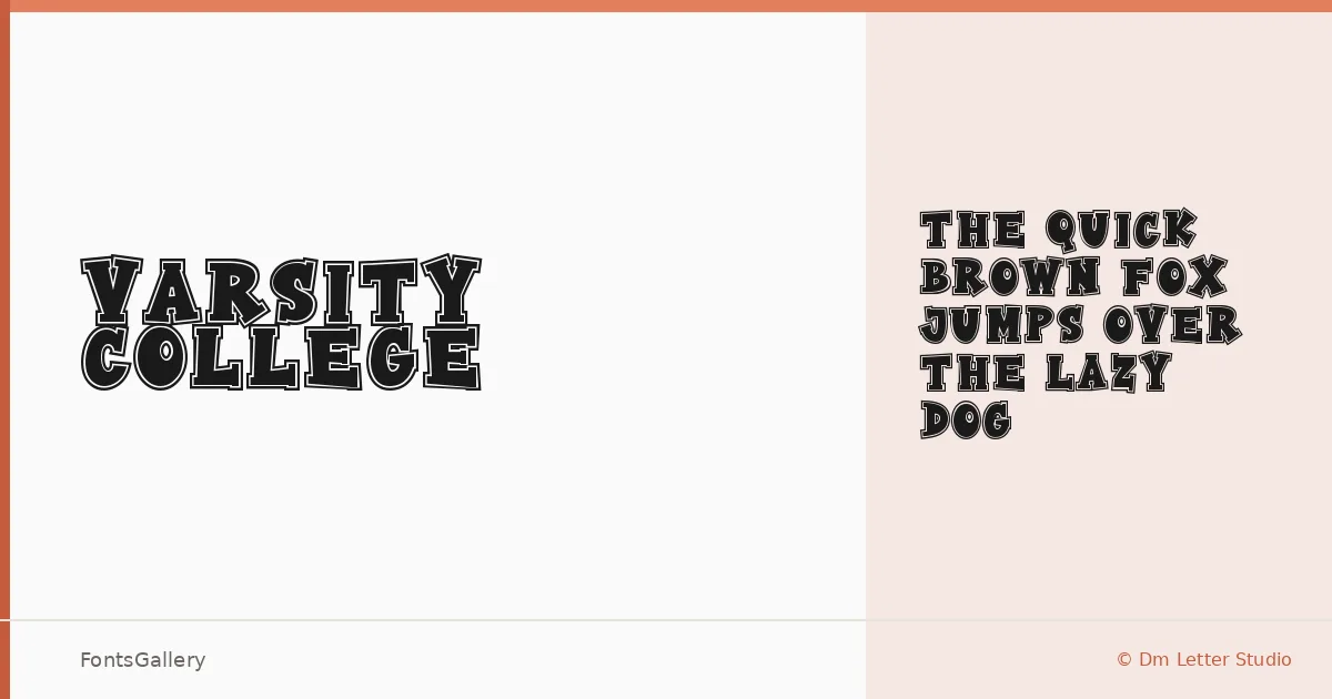
About Varsity College Font
There is something immediately recognizable about the letterforms here — the kind of confident, athletic energy borrowed from stadium signage and varsity lettering traditions. Designed by Dimas Prasetyo of Dm Letter Studio, this display face carries a classic, vintage weight that feels right at home on bold graphic work. The single Regular cut ships as a TTF file and wastes no time trying to be subtle.
Design Aesthetics & Character Characteristics
The mood is bold and playful without losing its classic composure — think old-school collegiate charm with enough graphic punch to hold its own at headline scale. As a display category face, it is built for impact rather than long-form reading, and the Latin character set keeps things clean and focused. The forms lean into a vintage sensibility that reads as deliberate rather than nostalgic for its own sake.
Recommended Usage & Font Pairing
This one is built for branding work, posters, logos, and T-shirt design — anywhere a headline needs to carry personality without additional decoration. The listed pairing families — Helvetica, Canela, Etna, AQUA, and Asap — each offer a useful contrast, whether you want the structural neutrality of a grotesk or the editorial softness of something more refined to balance the collegiate weight.
License & Usage Terms
This family is available under Personal Use terms only, and embedding is restricted — confirm a commercial license directly with Dm Letter Studio before taking it into any paid or client-facing work.