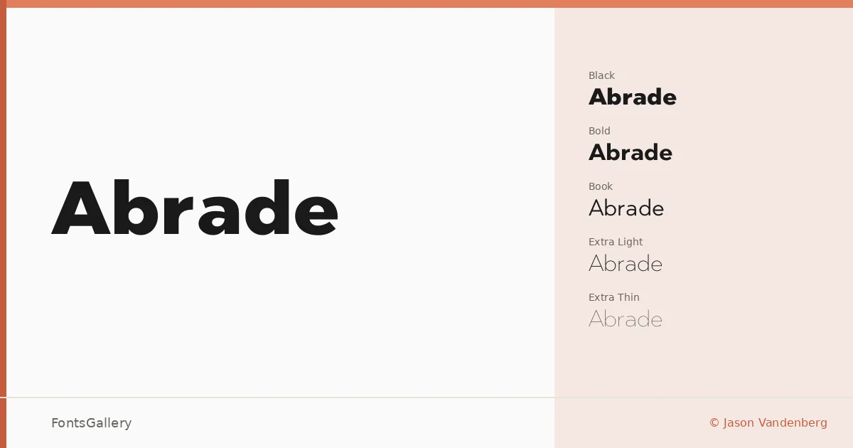
About Abrade Font
There is a particular discipline to the way this sans serif holds itself — no unnecessary curves, no decorative concessions, just clean geometric structure that earns its confidence. Jason Vandenberg built the family with a range that stretches from Hairline through Black, and the consistency of intent across that span is what makes it worth examining closely. The letterforms carry a modern minimalism without ever tipping into coldness.
Design Aesthetics & Character Characteristics
Abrade spans an exceptional weight range — Hairline, Extra Thin, Extra Light, Light, Book, Regular, Medium, Bold, Heavy, and Black — each accompanied by an italic, all delivered as OTF files. That gives you ten weights of upright and their matching obliques, which is a serious toolkit for any system requiring typographic hierarchy. The overall mood is professional and minimal, with a boldness that becomes most apparent in the heavier cuts. Cyrillic and Greek are both covered alongside Latin, broadening the range of editorial and branding contexts it can serve.
Recommended Usage & Font Pairing
The family earns its place in branding systems, magazine layouts, and website headers — anywhere that demands a clean, authoritative voice at display sizes. The weight range makes it particularly useful for logo lockups where contrast between a heavy primary mark and a lighter descriptor matters. For complementary faces, it has been paired with AQUA, Ballmain, 321 Impact, Aranea, and Batoshi, giving you options from decorative to structural depending on the job.
License & Usage Terms
This family is released under a Demo license, which does not permit commercial use — confirm licensing terms with Jason Vandenberg before committing it to a client project. Embedding is restricted to preview and print only.