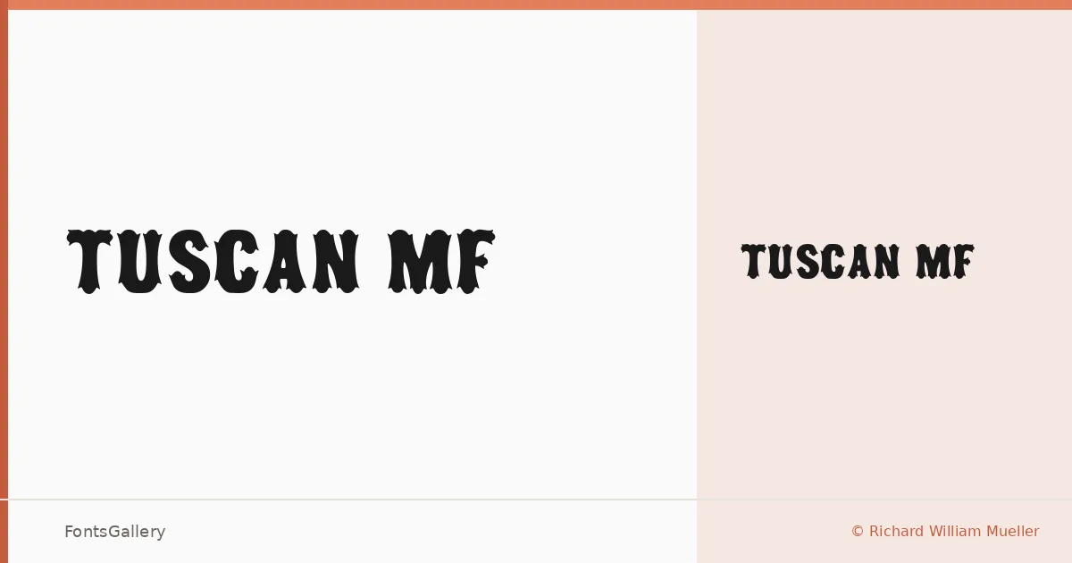
About Tuscan MF Font
There is something unmistakably frontier about the slab-bracketed serifs and bifurcated terminals that define the Tuscan style, and Richard William Mueller's interpretation leans into that heritage without apology. Drawn in 1993, this single-cut family delivers the condensed, upright authority of nineteenth-century wood type in a narrow format that concentrates its energy without crowding the page.
Design Aesthetics & Character Characteristics
The family ships as one style — Regular Narrow — in TTF format, which keeps the proposition clear: this is a dedicated display face with a bold, rustic, vintage character that earns its place at large sizes. The narrow proportions give it a vertical snap that reads well under pressure, the kind of letterform that holds its ground on a poster or a storefront without needing optical support from a second weight. The overall mood is classic Americana, raw but deliberate.
Recommended Usage & Font Pairing
It sits most naturally in branding, logo work, signage, and poster headlines — anywhere Latin-script type needs to carry a sense of history and craft. T-shirt designers and packaging art directors working in a heritage register will find it particularly useful. For pairings, the narrow, ornate texture contrasts well against quieter companions such as Helvetica or Bahnschrift, while more editorial combinations with Canela, ABC Arizona, or Etna can push the contrast toward something deliberately eclectic.
License & Usage Terms
Tuscan MF is released under Personal Use terms, which means commercial use is not permitted — confirm licensing directly with the rights holder before placing it in any client or revenue-generating work. Embedding is restricted, so be cautious when preparing PDFs or application packages.