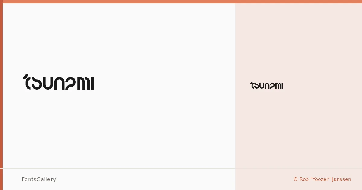
About Tsunami Font
There's a restless energy in these letterforms — the kind that feels like something is about to break or surge forward. Tsunami is a single-weight display face designed by Rob "Yoozer" Janssen, built around sharp, aggressive geometry that leans into the futuristic end of modern type design. Even at a glance, the Regular cut carries enough visual weight to anchor a composition on its own.
Design Aesthetics & Character Characteristics
Bold and playful at once, it sits in that productive tension between serious graphic impact and loose, almost irreverent energy. The single Regular style is available as a TTF file, which keeps the package tight and easy to deploy. The forms read with a modern confidence — angular enough to feel technical, but with enough quirk to keep things from going cold. It's the kind of face that thrives at large sizes where every decision in the outline becomes visible.
Recommended Usage & Font Pairing
Branding, poster work, logo lockups, social media graphics, and T-shirt design are all natural territory here — anything where display-scale impact matters more than extended text setting. For contrast, the structured regularity of Bahnschrift or Helvetica grounds it well, while a classical serif like Times New Roman or Canela creates a more deliberate high-low tension. Etna is worth considering if you want something with similar graphic presence in a supporting role.
License & Usage Terms
Tsunami is available for commercial use at no charge. Note that embedding permissions are restricted, so check your workflow requirements before embedding the font in PDFs or applications.