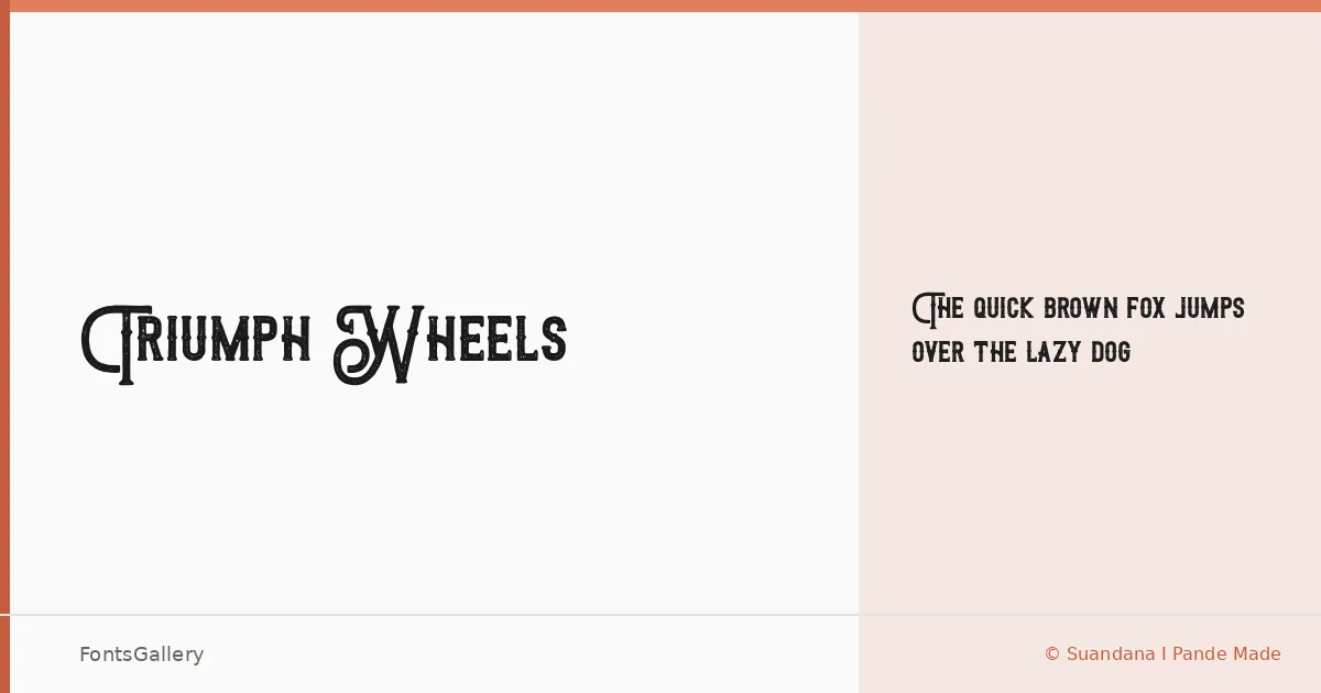
About Triumph Wheels Font
There is something deliberately worn about this face — the kind of roughness that reads as earned rather than decorative. Designed by Suandana I Pande Made, it arrives as a single cut: Triumph Wheels rough Regular, supplied in both TTF and OTF formats. The distressed edges and heavy strokes carry a classic, rustic character that feels rooted in an older vernacular of signage and hand-lettering.
Design Aesthetics & Character Characteristics
This is a display face built for presence. The bold weight and vintage texture give it the kind of authority that works at large sizes — headlines, logotypes, printed posters — where the rough treatment reads as intentional craft rather than noise. There is only the one style here, so the design earns its keep entirely on the strength of its letterforms: wide, confident, and carrying just enough irregularity to feel hand-made without becoming illegible.
Recommended Usage & Font Pairing
It sits naturally in branding, logo work, poster design, signage, and apparel graphics — anywhere a bold, vintage-inflected attitude is the point. For contrast, the clean geometry of Bahnschrift or Helvetica offsets the roughness well, while Etna or ABC Arizona can match its character-driven tone at a different weight. Canela's editorial warmth is another pairing worth considering when the context calls for something slightly more refined alongside it.
License & Usage Terms
Released under a Donationware license with personal-use terms only — confirm with the designer before committing it to any commercial job. Embedding is permitted for preview and print only.