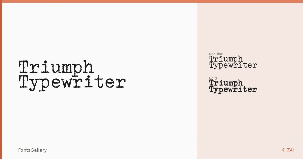
About Triumph Typewriter Font
There is something deliberately mechanical about these letterforms — the slight unevenness in stroke weight, the blunt terminals, the feel of ribbon meeting paper. Triumph Typewriter was designed by Tomasz Skowroński under the ZAI foundry, and it arrives in two cuts: Regular and Bold. Both are built on a strict monospace grid, which gives every character the same horizontal footprint and produces that characteristic typewritten cadence across a line.
Design Aesthetics & Character Characteristics
The family sits in classic, rustic, vintage territory without tipping into caricature — it reads as professional rather than nostalgic costume. The monospace construction means spacing is inherent to the design, not something you dial in afterward. Regular handles body-weight applications while Bold adds enough mass for headlines or emphasis, and the coverage spans both Latin and Cyrillic scripts. Files ship in TTF and OTF formats.
Recommended Usage & Font Pairing
The face earns its place in branding, logo lockups, magazine editorial headers, poster work, and T-shirt design — anywhere a restrained retro authority reads well. For pairing, the structured neutrality of Helvetica or Bahnschrift gives it a clean counterpart, while Canela or ABC Arizona bring an editorial warmth that sits interestingly against the mechanical rhythm. Etna offers another direction if you want more personality in the companion face.
License & Usage Terms
Triumph Typewriter is released under Personal Use terms, which means commercial use is not permitted — confirm licensing directly with ZAI before applying it to a paid project. Embedding is set to installable.