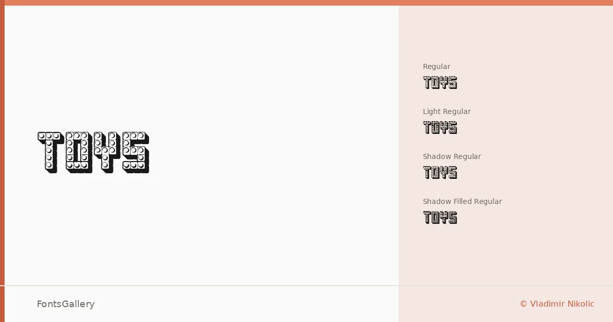
About Toys Font
There's a handcrafted buoyancy to these letterforms — chunky, slightly irregular, with the kind of energy that feels drawn rather than engineered. This display family was created by Vladimir Nikolic and carries a distinctly vintage-playful character that sits somewhere between a carnival broadside and a children's storybook illustration.
Design Aesthetics & Character Characteristics
The family spans four cuts delivered as TTF files: a Light Regular, a standard Regular, a Shadow Regular, and a Shadow Filled Regular — that last pair giving you immediate depth and dimension options without any extra layering work. The mood is bold and whimsical, with enough retro warmth to read as vintage without feeling dated. The shadow variants in particular push the whole set toward poster-ready territory, adding a three-dimensional pop that suits large-scale applications well.
Recommended Usage & Font Pairing
This family earns its keep on children's book covers, packaging, T-shirt graphics, and anywhere a logo or poster needs character over refinement. The shadow cuts work especially hard on printed goods where you want that old-school dimensional feel. For contrast, the listed pairing recommendations include the clean neutrality of Helvetica or Aileron alongside more expressive companions like AQUA, Abrade, and Aranea — all of which give you room to anchor the playfulness with something steadier in body copy or supporting text.
License & Usage Terms
This family is available under Personal Use terms, which means commercial use is not permitted — confirm licensing directly with Vladimir Nikolic before using it in any client or commercial job. Embedding is permitted for preview and print only.