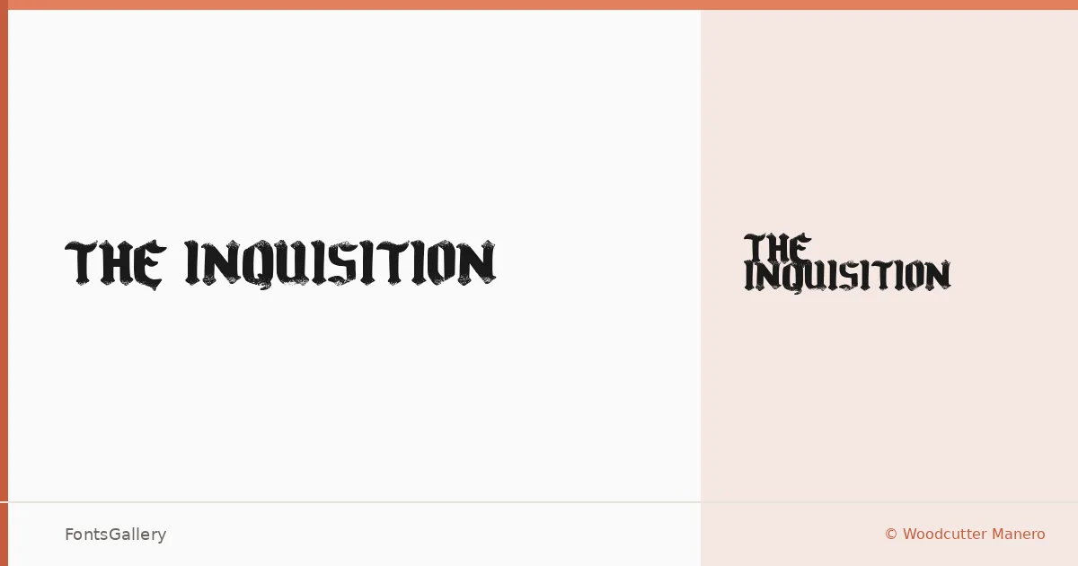
About The Inquisition Font
There is a particular weight to a well-drawn blackletter — the way thick strokes press into the page and the thin hairlines pull back just enough to create tension. This single-cut family, designed by Woodcutter Manero, carries that quality throughout its Latin character set. The Regular delivers the dense, ink-saturated texture that the blackletter tradition demands, with a grunge undercurrent that keeps it from feeling like a museum reproduction.
Design Aesthetics & Character Characteristics
The mood here sits firmly in bold, classic territory while leaning into vintage roughness — the kind of letterform that suggests age and severity in equal measure. Available as a TTF in a single Regular cut, it works best when set large, where the contrast between strokes and the organic imperfections of the design can be read clearly. This is not a text face; it is a display instrument built for impact at headline scale.
Recommended Usage & Font Pairing
Book covers, posters, branding marks, and T-shirt graphics are its natural territory — anywhere a strong historical register needs to be established quickly. The Latin coverage handles English and Western European copy without issue. Paired against the clean geometry of Helvetica or Bahnschrift, the contrast sharpens nicely; set alongside the editorial warmth of Canela or ABC Arizona, or the structured character of Etna, it takes on a more considered, designed quality.
License & Usage Terms
This family is released under Personal Use terms — commercial use is not permitted, so confirm the terms with Woodcutter Manero directly at [email protected] or via woodcutter.es before deploying it in any paid work.