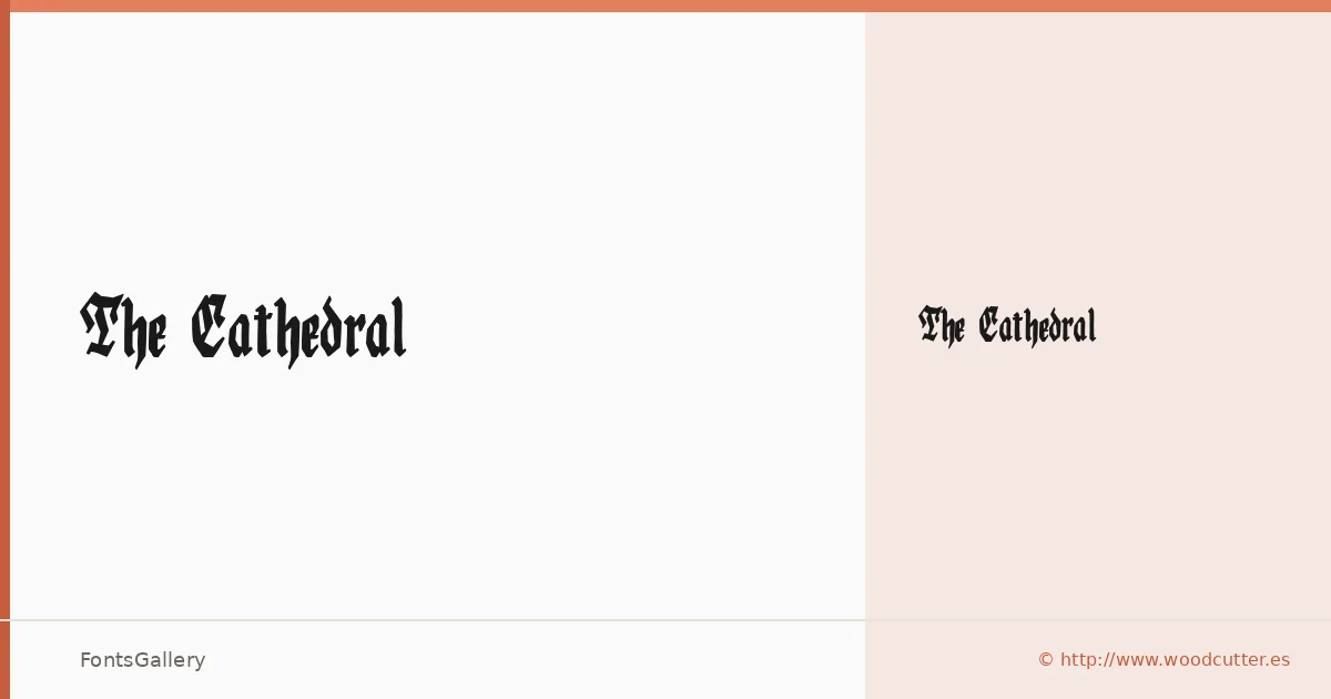
About The Cathedral Font
There is something genuinely heavy about this blackletter — the strokes carry the compressed weight of manuscript tradition, with broken angles and dense texture that feel pulled from a medieval scriptorium rather than assembled digitally. It comes from Woodcutter Manero, released under the Woodcutter Fonts Lab imprint. Only a single cut is included: Regular, delivered as an OTF file.
Design Aesthetics & Character Characteristics
This is a blackletter with a grunge edge — classic in its gothic bones but rougher in execution, which pushes it closer to vintage concert posters or distressed branding than to formal calligraphy. The mood is bold and ceremonial at once, the kind of face that reads as authoritative even at large sizes. Latin character coverage keeps it focused rather than sprawling, and within that range the letterforms hold up cleanly in print contexts where strong contrast and historical character matter.
Recommended Usage & Font Pairing
It sits most naturally in high-impact single-word or short-phrase settings: logotypes, poster headlines, certificate titling, and T-shirt graphics where the blackletter silhouette does the expressive work instantly. For layouts that need more room to breathe around it, the pairing list leans on clean contrasts — Helvetica and Bahnschrift supply geometric neutrality, while Canela and ABC Arizona bring editorial warmth; Etna offers a more textured middle ground. Any of those companions give the gothic forms space without competing with them.
License & Usage Terms
This family is released under Personal Use terms — commercial use is not permitted, so confirm licensing with Woodcutter Manero directly at [email protected] or via http://www.woodcutter.es before applying it to client work.