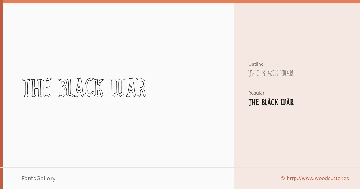
About The Black War Font
There is a rawness to this face that feels deliberately unresolved — ink traps bitten deep, edges that look dragged across rough stock rather than set by a machine. It comes from Woodcutter Manero, whose work sits squarely in the grunge and vintage display tradition. Two cuts are available in OTF: a solid Regular and an Outline companion that opens up the interior of each letterform.
Design Aesthetics & Character Characteristics
This is a display family built for weight and attitude — bold, rustic, and carrying the visual wear of something pulled from an old broadside or a screen-printed run. The Outline version gives you a lighter silhouette while keeping the same battered geometry, so the two cuts can work together at different scales or contrast levels. The Latin character set covers the core Western alphabet, nothing more, and the OTF format keeps things clean for layout work.
Recommended Usage & Font Pairing
Headline settings, poster work, logo lockups, and T-shirt graphics are the natural territory here — anything that benefits from the kind of hand-worn authority this style carries. For branding applications, the listed pairings worth reaching for are Etna, Canela, Helvetica, ABC Arizona, and Bahnschrift, each of which can balance the roughness with something cooler or more structural underneath.
License & Usage Terms
This family is released under Personal Use terms — commercial use is not permitted, so confirm clearance with Woodcutter Manero directly at [email protected] before taking it into any paid or revenue-generating project.