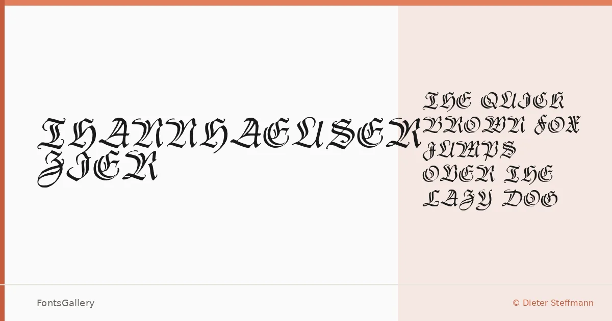
About Thannhaeuser Zier Font
These are ornamental initials — decorative capital letters drawn in the blackletter tradition, digitized by Dieter Steffmann from Herbert Thannhauser's original Zierbuchstaben designs of 1937–38. Each glyph carries the dense, architectural weight of Fraktur construction, with flourishes that feel genuinely historical rather than imitated. The single Regular cut is exactly what it needs to be: a set of drop-cap letters built for ceremony.
Design Aesthetics & Character Characteristics
The mood sits squarely in bold, classic blackletter territory — vintage in origin, elegant in execution. Because the family consists of a single Regular style delivered as a TTF, there is no weight range to navigate; you get one authoritative voice, and that voice is loud in the best gothic sense. The letterforms are dense with internal detail, the kind that rewards large-scale setting where every stroke and hairline can breathe.
Recommended Usage & Font Pairing
The natural homes for this family are jobs that call for heraldic weight and historical gravitas: poster headlines, certificate drop-caps, logo marks, branding that leans into craft or heritage, and T-shirt graphics where the blackletter register reads instantly. Pairing these initials with a clean contemporary face — Helvetica or Asap for workhorse body copy, Canela or ABC Arizona for editorial elegance, Etna for something with its own structural character — creates the contrast that makes both typefaces work harder.
License & Usage Terms
Thannhaeuser Zier is available for commercial use, and the license explicitly permits installable embedding — the designer's own note reads simply "have fun and enjoy."