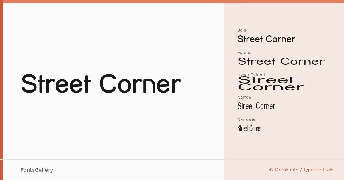
About Street Corner Font
There is something immediately legible about these letterforms — a confident, squared geometry that recalls hand-painted storefronts and mid-century signage without feeling nostalgic for its own sake. The family is the work of GemFonts / Typotheticals, and it carries the kind of structural clarity that comes from designing for the eye at distance. Every cut stays true to a single disciplined skeleton, which is what gives the whole collection its coherence.
Design Aesthetics & Character Characteristics
This is a display family built around a bold, classic register — professional enough for institutional branding, vintage enough to carry warmth. The fourteen styles span an unusually broad width range: Regular, SemiBold, Bold, Thin, Oblique, Extend, HyperExtend, Narrow, and Narrower, plus a full Upper series covering Extend, Narrow, Narrower, and Oblique cuts. All files are delivered as TTF. The Upper variants enforce an all-caps construction, which sharpens the signage quality considerably, while the HyperExtend pushes the horizontal stress to a theatrical extreme that reads beautifully on a single headline line.
Recommended Usage & Font Pairing
The natural territory here is anywhere Latin letterforms need to carry authority at scale — poster headlines, logo lockups, exterior signage, and brand wordmarks where a strong silhouette matters more than texture. The width variants give you real compositional control across narrow column flags and wide banner formats alike. It pairs well with the editorial softness of Canela or ABC Arizona, the neutral utility of Helvetica or Bahnschrift, and the structured warmth of Etna.
License & Usage Terms
Street Corner is available for commercial use under its stated license, with installable embedding permissions included.