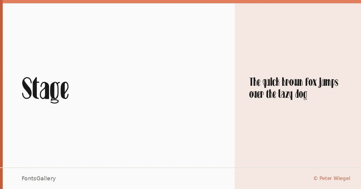
About Stage Font
There is a theatricality to these letterforms that earns the name — a display face by Peter Wiegel that carries the weight of classic showbill lettering without tipping into pastiche. The single Regular cut is delivered as a TTF, drawn with the kind of deliberate stroke contrast that reads as both elegant and commanding at large sizes.
Design Aesthetics & Character Characteristics
This is a display design in the fullest sense: bold enough to anchor a composition, classical enough to suggest heritage, and vintage in the way that well-aged wood type is vintage — not nostalgic for its own sake, but genuinely authoritative. The Regular weight is the whole family here, so its character has to carry the range alone, and it does so with an elegance that suits formal contexts as well as expressive ones. Latin script is supported throughout.
Recommended Usage & Font Pairing
The face is built for situations where a headline needs presence — posters, magazine covers, logo lockups, and branding work where a classic tone is the point. It pairs well with the clean rationalism of Helvetica or Josefin Sans, and holds its own alongside more editorial companions like Canela, ABC Arizona, or Asap when you need contrast between display and text layers.
License & Usage Terms
Stage is released under the SIL Open Font License and the GPL — General Public License with font exception, both of which allow commercial use. Embedding is permitted at the installable level, so you can distribute documents with the font embedded without restriction.