About Solaria Font
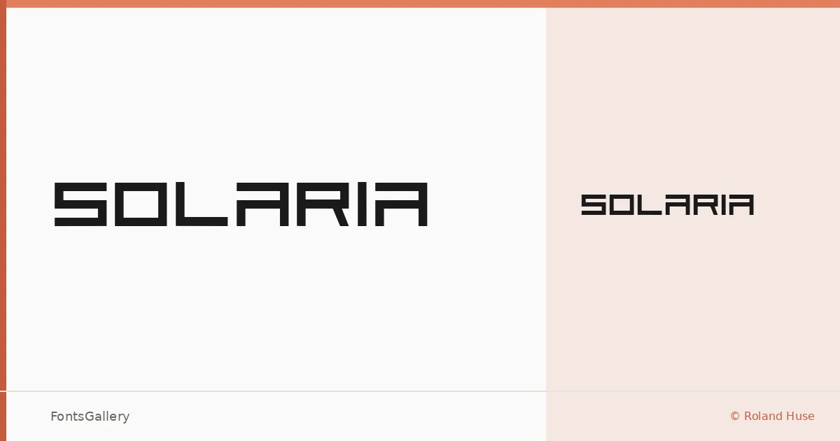
There is a clean geometric confidence to this display face — the kind of letterform that holds its shape at large sizes without demanding attention through decoration. Designed by Roland Huse, Solaria arrives as a single Regular cut, which is exactly the right count for a typeface this focused in its intent.
Design Aesthetics & Character Characteristics
The mood is futuristic and minimal, landing somewhere between cold precision and considered modernism. At its core it is a display design — built for scale, for impact, for the moments when a headline or a logo mark needs to carry the full weight of a composition. The TTF file is installable, so it drops cleanly into a workflow without friction. Its boldness is structural rather than decorative: you get strong presence without noise.
Recommended Usage & Font Pairing
This is a natural choice for branding systems, poster headlines, logo lockups, and apparel graphics where a single word or short phrase needs to land hard. Pair it with something that can absorb the contrast — Canela or ABC Arizona bring warmth and editorial texture that balances the cool geometry well, while Helvetica or Bahnschrift keep things clinical and systematic. Etna offers a middle path, adding a touch of structure without competing for dominance.
License & Usage Terms
Solaria is available under Personal Use terms — free for personal projects only. For any commercial application, confirm permission directly with Roland Huse at [email protected] before the job goes live.