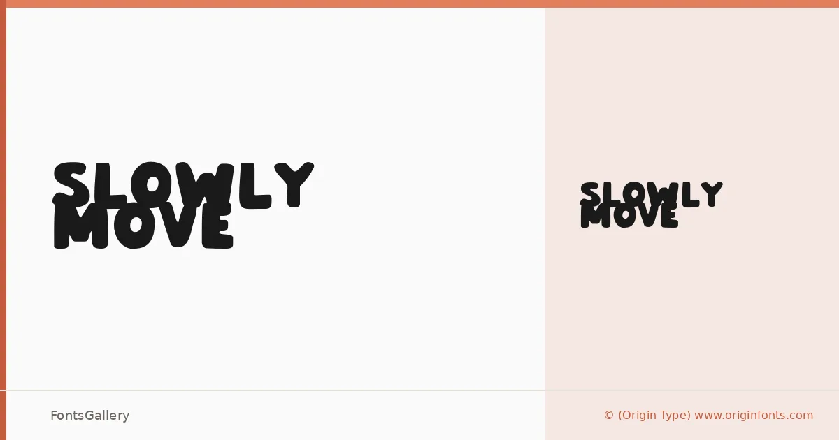
About Slowly Move Font
There is something deliberately unhurried in the way these letterforms stretch and lean — a display face from Origin Type that seems to resist urgency while still commanding attention. The single Regular weight delivers a whimsical, modern energy built into every character, with forms that feel drawn rather than constructed.
Design Aesthetics & Character Characteristics
This is a display typeface in the boldest sense of the word: opinionated, playful, and built for situations where the type itself is the visual. The OTF file comes as a single Regular cut, so its personality has to do all the heavy lifting — and it does, through letterforms that balance modern geometry with a loose, almost handmade quality. Latin character coverage is partial, which is worth checking against your copy before committing.
Recommended Usage & Font Pairing
It earns its keep in branding, logo lockups, poster headlines, social media graphics, and T-shirt design — anywhere that rewards type with genuine character over type that simply reads quietly. For body copy or secondary text, it pairs naturally with the calmer dispositions of Canela, Helvetica, or Bahnschrift; if you want contrast in a different direction, Etna or ABC Arizona both hold their ground alongside it.
License & Usage Terms
Slowly Move is offered under Personal Use terms, which means commercial use is not permitted — confirm licensing directly with Origin Type at originfonts.com before using it in any paid or client-facing work.