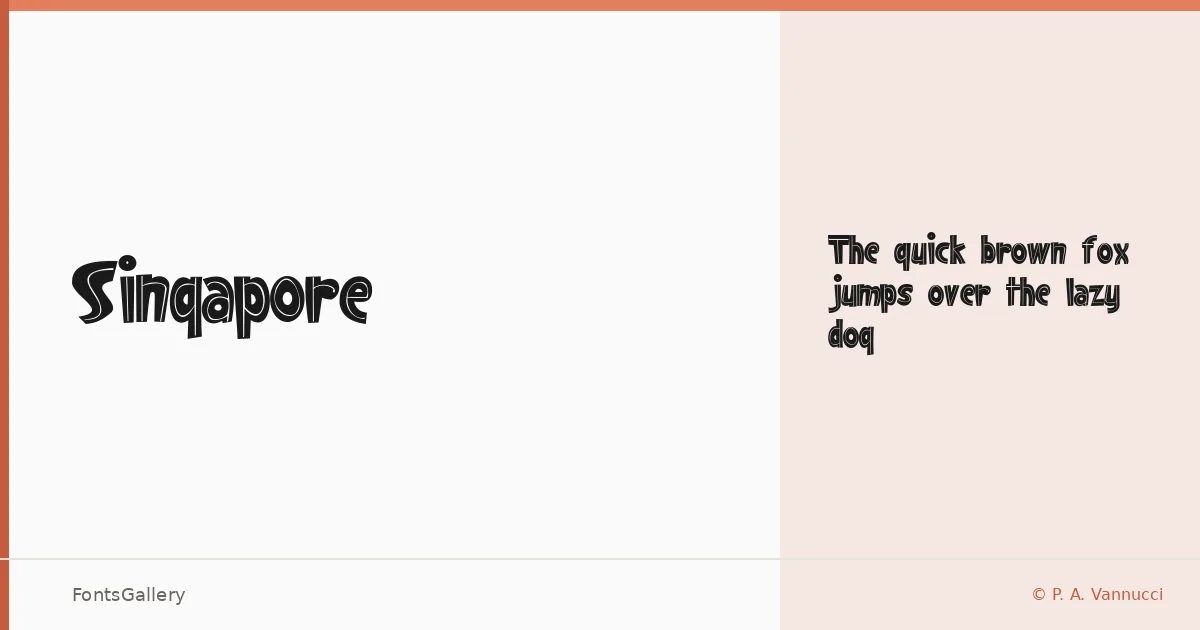
About Singapore Font
There is something deliberately rough-hewn about this display face — the kind of character you find in hand-lettered signage where the maker's hand is never quite hidden. It comes from P. A. Vannucci of Alphabetype, released under copyright in 2011, and exists as a single cut: Regular. The forms carry weight without apology, leaning into a boldness that feels earned rather than mechanical.
Design Aesthetics & Character Characteristics
Sitting squarely in the display category, it reads as bold, playful, and distinctly rustic — the kind of vintage energy that suits a headline or a mark rather than a body of text. That single Regular style is delivered as a TTF with installable embedding permissions, and its partial Latin coverage is enough for the short, punchy uses it was drawn for. Up close, the letterforms have the irregular confidence of something stamped or pressed rather than drawn on a grid.
Recommended Usage & Font Pairing
It earns its keep on posters, T-shirt graphics, social media headers, and anywhere a brand or logo needs a touch of worn, vintage character to feel authentic rather than corporate. For contrast, it pairs well with the clean neutrality of Helvetica or Aileron, and more editorial combinations work with Canela, Abrade, or ABC Arizona, where their refined structures give the rougher display energy somewhere to breathe.
License & Usage Terms
Singapore is released under Personal Use terms as freeware by P. A. Vannucci — commercial use is not permitted under these terms, so confirm licensing directly before applying it to any commercial job.