About Seven Segment Font
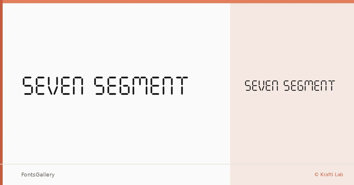
There is an immediate logic to this face — the segmented forms of a digital readout, translated into a typeface by Onur Cem TAN of Krafti Lab. Every letterform is built from the same horizontal and vertical bar vocabulary you recognize from LCD displays and electronic scoreboards, giving the whole set a tight internal consistency that purely invented display faces rarely achieve.
Design Aesthetics & Character Characteristics
Sitting firmly in the Display category, the design leans into a futuristic, minimal aesthetic without ornament or softness — the geometry does all the work. The family ships as a single Regular cut in TTF format, which focuses its personality rather than diluting it across a range of weights. In use, the rigid segment structure reads as modern and bold, the kind of letterform that communicates precision and technical confidence at a glance.
Recommended Usage & Font Pairing
The face earns its keep in branding, logo work, poster headlines, signage, and t-shirt design — anywhere the digital-display reference adds meaning or attitude rather than feeling arbitrary. It covers Latin partially, so verify character support against your copy before committing to a layout. For pairing, the clean rationalism of Bahnschrift or Helvetica makes a natural companion in supporting text, while Canela or Times New Roman offers a deliberate contrast in warmth and organic weight; Etna sits closer to the mechanical register if you want tonal consistency.
License & Usage Terms
Seven Segment is released under Personal Use terms, which means commercial use is not permitted — confirm licensing with Krafti Lab before deploying it in any paid or client-facing work. Embedding is limited to preview and print only.