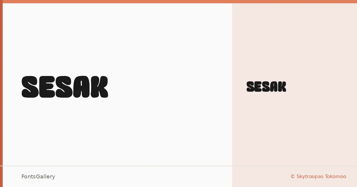
About SESAK Font
There is a density to these letterforms — a packed, confident weight that announces itself without hesitation. SESAK comes from Skytroopas Tokomoo, and it arrives as a single Regular cut built for moments that need presence rather than subtlety.
Design Aesthetics & Character Characteristics
This is a display face in the boldest sense: modern in construction, playful in its energy, and unapologetically heavy on the page. The single Regular style ships in both TTF and OTF formats, so it drops into most workflows without friction. The forms carry that compressed, assertive quality you often find in type meant to fill a frame rather than flow across a paragraph.
Recommended Usage & Font Pairing
It earns its place in branding systems, poster hierarchies, logo lockups, and T-shirt graphics — anywhere a headline needs to hold a room. Latin coverage is partial, so verify your character needs before committing to a project with extended copy. For contrast, the clean geometry of Bahnschrift or Helvetica will balance the weight cleanly, while Canela or Times New Roman adds a softer editorial counterpoint; Etna sits closer in personality and works well when you want a complementary display pairing.
License & Usage Terms
This family is released under a Personal Use license, which means commercial use is not permitted — confirm licensing terms with Skytroopas Tokomoo before applying it to any paid or client-facing work.