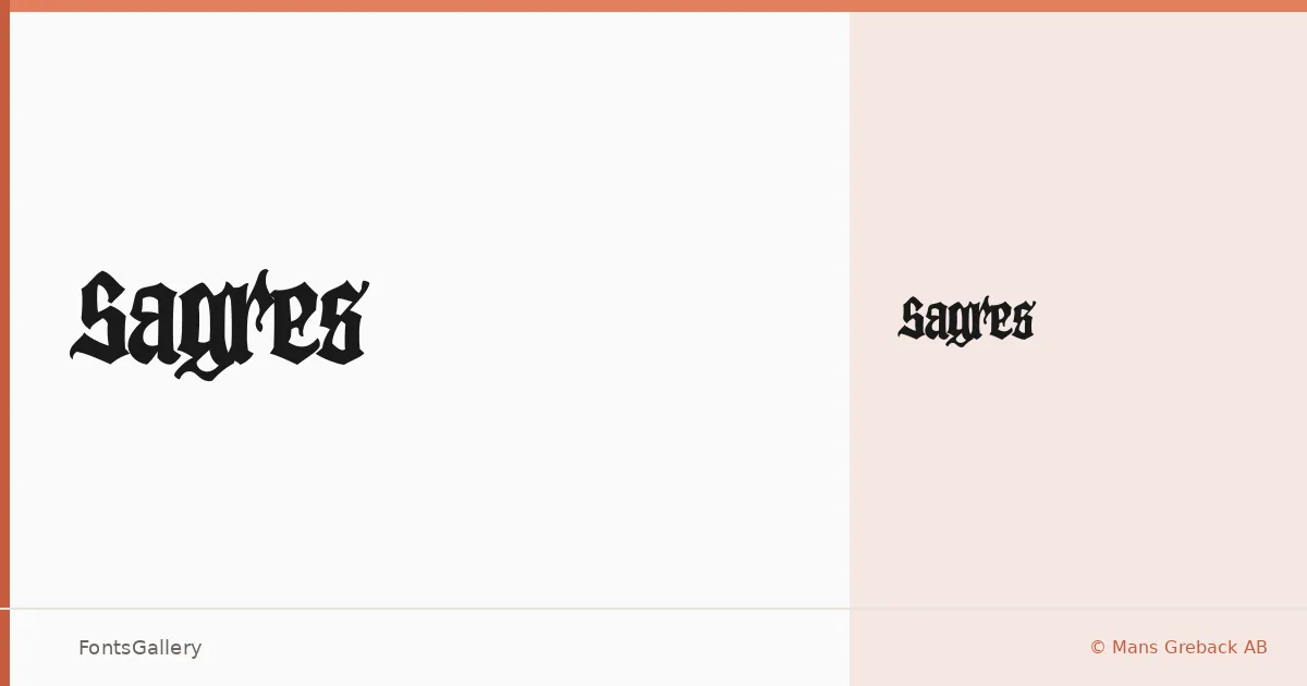
About Sagres Font
There is something deliberately weathered about this blackletter — the strokes carry the authority of historical type but with an edge that reads as raw rather than archival. Designed by Mans Greback of Mans Greback AB, Sagres arrives as a single Regular weight in OTF format, built around the dense, angular forms that define the blackletter tradition while leaning into a grunge sensibility that keeps it from feeling purely decorative.
Design Aesthetics & Character Characteristics
The mood is bold and vintage without being precious — the kind of letterform that communicates age and grit simultaneously. Latin and Latin Extended (partial) coverage is included, along with Vietnamese support, which broadens its reach considerably for a face this stylistically focused. At display sizes, the classic structure of the capitals and the textured quality of the strokes become the main event, demanding attention without needing additional ornamentation.
Recommended Usage & Font Pairing
It earns its place in branding, poster work, packaging, logo design, and T-shirt graphics — contexts where a strong graphic voice matters more than extended reading. For contrast, the clean geometry of Helvetica or Bahnschrift gives it room to breathe, while Canela or ABC Arizona provide a more editorial tension. Etna offers a complementary historical register if you want to keep the mood consistent across a layout.
License & Usage Terms
Sagres is available under Personal Use terms only — confirm a commercial license directly at www.mansgreback.com before using it in any client or commercial work, as embedding is also restricted under the current terms.