About Sacco Font
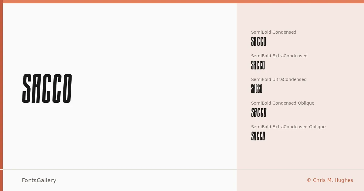
There is something immediately confrontational about the proportions here — a semi-bold weight pushed hard into condensed and ultra-condensed widths, the letterforms stacking tall and narrow like hand-lettered trade cards or vintage broadside type. Chris M. Hughes designed this family, and it carries a clear point of view: compressed, assertive, with just enough irregularity to read as grunge without losing legibility at display sizes.
Design Aesthetics & Character Characteristics
This is a display family in the condensed grotesque tradition, but the mood sits somewhere between modern editorial and weathered vintage — bold and raw rather than clinical. The family offers three compression widths — Condensed, ExtraCondensed, and UltraCondensed — each available in upright and oblique cuts, giving you nine styles to work with across TTF, EOT, WOFF, and WOFF2 formats. The oblique angles add a kinetic lean that suits short bursts of text especially well, and the UltraCondensed cuts push the compression to a point that starts to feel almost typographic illustration. Language coverage extends to Latin (partial), Cyrillic, and Greek.
Recommended Usage & Font Pairing
The natural territory here is anywhere a headline needs to command its column: poster work, branding lockups, logo treatments, and T-shirt graphics where the compression lets you fit more weight into a tight band of space. For pairing, the family works alongside Helvetica or Bahnschrift when you want a neutral sans to carry body text, and it contrasts effectively with the editorial softness of Canela or the character of Etna and AQUA.
License & Usage Terms
Sacco is released under the SIL Open Font License, which allows commercial use. Embedding is permitted in editable documents.