About Rounded Robin Font
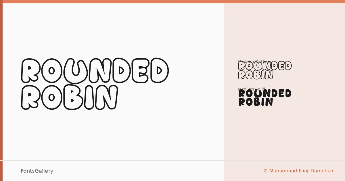
There is something immediately warm about these letterforms — every corner softened, every terminal cushioned into a curve that invites rather than demands. Muhammad Panji Ramdhani designed this display family under the Sipanji x Figuree collaboration, and the result carries a deliberate, hand-considered playfulness that feels neither accidental nor overworked.
Design Aesthetics & Character Characteristics
The family arrives in two complementary OTF cuts: a Medium Solid and a Medium Outline, giving you the same generous rounded structure in two distinct weights of presence. The Solid is immediate and bold; the Outline breathes more openly, useful when the background needs room to participate. Both share the same whimsical geometry — thick strokes, plump bowls, and a rhythm that leans naturally toward branding work and expressive headline settings rather than body text. Latin character coverage supports the core use cases without overreach.
Recommended Usage & Font Pairing
The weight and character of these cuts make them well suited to children's book titles, poster headlines, logo lockups, and T-shirt graphics where a bold, playful tone is the whole point. For pairing, the clean geometry of Helvetica or Bahnschrift grounds it as a text companion, while Canela or Etna bring a more editorial contrast; AQUA sits closer in mood if you want display-on-display layering that stays cohesive.
License & Usage Terms
Rounded Robin is available under Personal Use terms as defined by Figuree Studio's Licensed — confirm clearance at https://figureestudio.com/license/ before committing it to any commercial job.