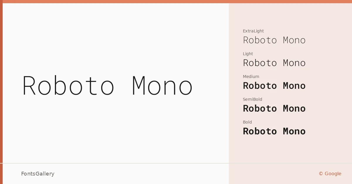
About Roboto Mono Font
Every character sits in an identical horizontal slot — that's the commitment monospacing demands, and Christian Robertson at Google met it without sacrificing the clean, humanist warmth that defines the broader Roboto lineage. Each glyph is engineered for clarity at small sizes and sustained reading, with open apertures and consistent stroke weight that keep columns of text or code from feeling mechanical and cold.
Design Aesthetics & Character Characteristics
This is a minimal, modern, professional monospace that spans an uncommonly wide weight range: Thin and ExtraLight at the delicate end, through Light, Regular, Medium, and SemiBold, up to Bold — each with a matching italic. Variable fonts are also included, giving you continuous weight control within a single file. All styles ship as TTF and carry the same fixed-pitch discipline, so alignment is rock solid whether you're setting a table of figures or a pull-quote in a grid-heavy layout.
Recommended Usage & Font Pairing
The fixed-width structure makes it a natural fit for website headers, data-driven magazine spreads, business cards where precision signals credibility, and presentation decks that benefit from a technical but refined register. Latin, Vietnamese, Cyrillic, and Greek language support broadens its reach across multilingual branding and business work. It pairs well with the geometric neutrality of Helvetica, the editorial softness of Canela, the distinctiveness of ABC Arizona, and the contrasting texture of Abrade or (AH) Manal when you need warmth to offset its cool regularity.
License & Usage Terms
Released under the SIL Open Font License, Version 1.1 — commercial use is permitted, and the embedding permission is set to installable. Full license terms and FAQ are at https://openfontlicense.org.