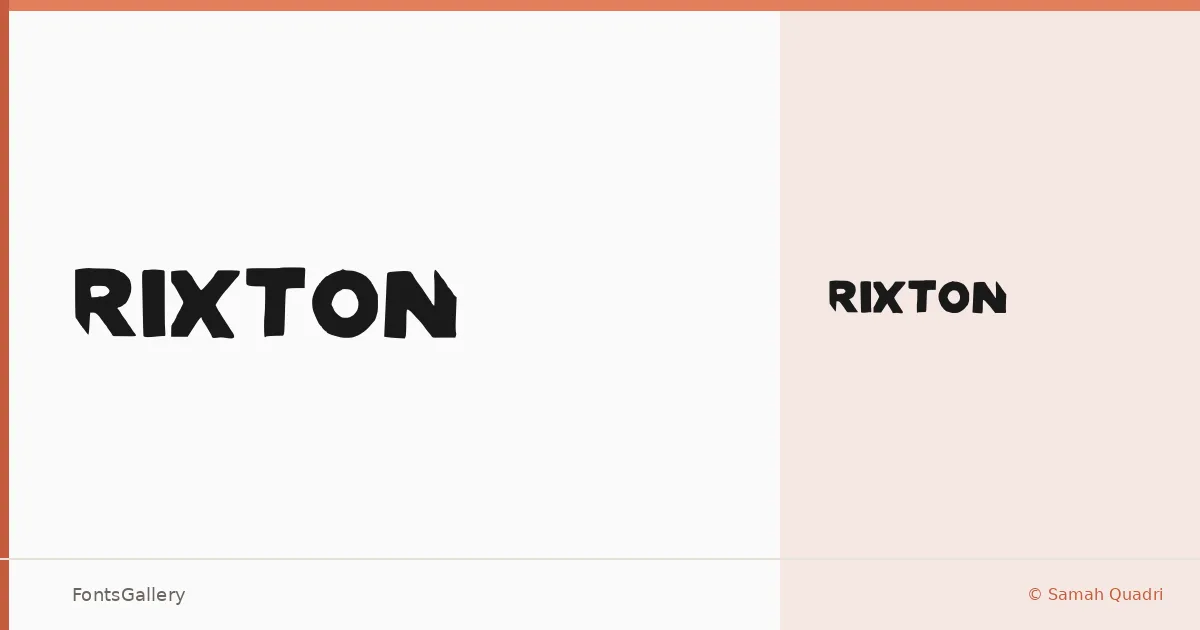
About RIXTON Font
There is a certain confidence in the way these letterforms carry themselves — broad, assertive, and designed to stop the eye rather than guide it. RIXTON was created by designer Samah Quadri and arrives as a single display cut, Medium weight, delivered in TTF format.
Design Aesthetics & Character Characteristics
This is a display face built for impact: bold strokes, a modern sensibility, and just enough playfulness to keep it from feeling stiff. The single Medium style means there is no weight range to navigate — what you see is a focused, deliberate voice rather than a workhorse system. In use, the letterforms feel confident at large sizes, where their character has room to read fully.
Recommended Usage & Font Pairing
It belongs in contexts where the type is doing real work: headlines, posters, logos, branding identities, and T-shirt graphics where a single word or short phrase needs to carry the whole composition. For surrounding copy or contrast, the listed pairing options cover a useful range — the neutral geometry of Bahnschrift or Helvetica, the editorial warmth of Canela, the familiarity of Times New Roman, and the structure of Etna all sit credibly alongside it.
License & Usage Terms
This family is offered under Personal Use terms, which means commercial use is not permitted — confirm licensing directly with the designer before taking it into a paid project.