About Rivalry Font
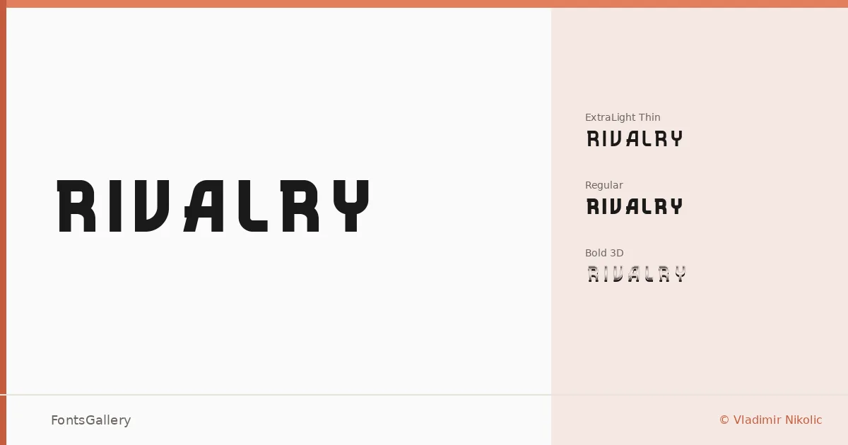
There is a compressed, forward-leaning energy to these letterforms that announces itself immediately — the kind of tension you feel in a well-set sports headline or a brand mark that needs to hold its ground at any scale. The family was designed by Vladimir Nikolic and includes three distinct cuts: Rivalry Thin (ExtraLight), Regular, and the striking 3D variant, which carries trademark status and adds a dimensional layer that sets it apart from a conventional display weight.
Design Aesthetics & Character Characteristics
This is a display family with a futuristic, modern edge and enough professional control to keep it from tipping into novelty. The Thin cut offers contrast and breathing room, the Regular holds a clean structural authority, and the 3D style gives you an extruded depth that reads boldly from a distance. All three are delivered as TTF files. Together they create a range that can shift between refined and aggressive depending on how you deploy them.
Recommended Usage & Font Pairing
The family is built for high-impact contexts: posters, logos, branding systems, and T-shirt graphics where a headline needs to carry visual weight on its own. The 3D cut in particular rewards large-format treatment. For type pairings, the listed companions — Helvetica, Canela, Etna, AQUA, and Asap — offer a useful range, from neutral grotesque to editorial serif, depending on how much contrast you want against the display styles.
License & Usage Terms
Rivalry is released under Personal Use terms, which means commercial use is not permitted — confirm licensing directly with Vladimir Nikolic before applying it to any client or revenue-generating work. Embedding is limited to preview and print only.