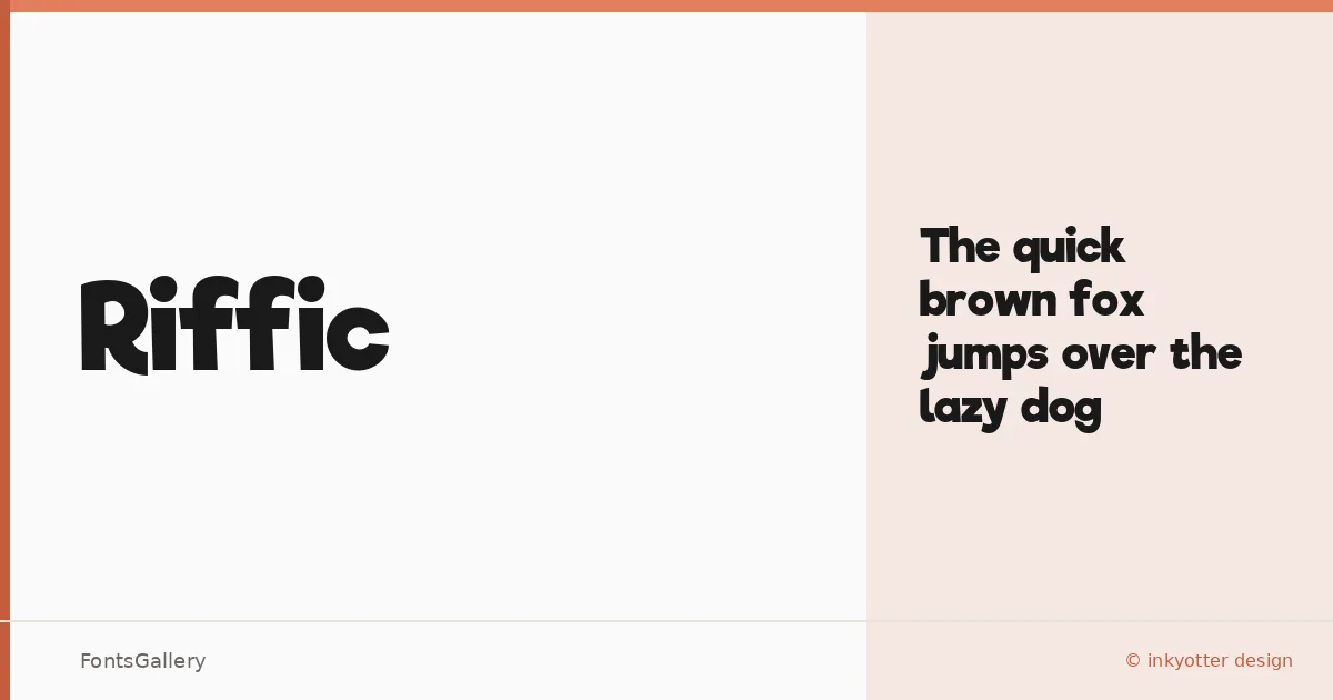
About Riffic Font
There is an infectious energy to these letterforms — rounded, confident, and carrying just enough quirk to feel genuinely playful rather than simply loud. Riffic is a display family from Inkyotter Design, offered here in a single Bold weight that commits fully to its personality without hedging toward neutrality.
Design Aesthetics & Character Characteristics
The design sits squarely in display territory: bold strokes, whimsical proportions, and a modern attitude that reads immediately at large sizes. There is one style in the family — Bold — delivered as a TTF, which keeps things direct. The forms feel warm rather than aggressive, leaning into branding and headline work where a little character goes a long way.
Recommended Usage & Font Pairing
This is a face built for Latin-language headlines, posters, logos, and T-shirt graphics — anywhere the type needs to hold attention before a single word is read. For body copy or supporting text, it pairs well against the clean rationalism of Helvetica or Josefin Sans, the editorial softness of Canela or ABC Arizona, and the friendly geometry of Asap, each offering useful contrast without competing with the display weight's energy.
License & Usage Terms
This family is available for commercial use, with embedding set to editable — making it straightforward to use in documents and layouts that require embedded font data.