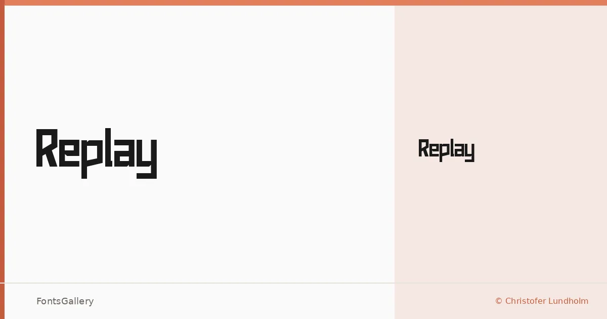
About Replay Font
There is something deliberately mechanical about the letterforms here — angular, tightly constructed, and built with the kind of confidence that belongs to display type meant to be seen at size. Released by Christofer Lundholm, the family arrives as a single Regular weight, which focuses its personality rather than dilutes it.
Design Aesthetics & Character Characteristics
This is a display face with a futuristic, modern edge — the sort of geometry that reads as forward-leaning without tipping into novelty. The single Regular cut is delivered as a TTF, and its forms carry a bold presence even at that one weight, relying on structural sharpness rather than mass to assert itself. Latin coverage is partial, so it suits headline-level settings where the character set rarely gets stressed.
Recommended Usage & Font Pairing
It earns its keep in branding, logo work, posters, and T-shirt design — anywhere a headline needs to land with authority and a modern edge. For body copy or secondary text, it pairs well alongside Helvetica or Bahnschrift for something neutral and workhorse-reliable, or against Canela and ABC Arizona when you want contrast with warmth and editorial weight. Etna sits closer in energy and can work as a companion display face when you need more than one headline register.
License & Usage Terms
This family is available for commercial use under its stated license terms. Embedding is permitted for preview and print only, so factor that in for any interactive or document-embedding workflow.