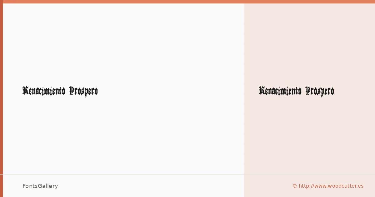
About Renacimiento Prospero Font
There is a particular weight to a well-drawn blackletter — the thick strokes pressing into the page, the angular terminals carrying centuries of manuscript tradition. This face comes from Woodcutter Manero, whose work sits at the intersection of historical craft and contemporary graphic energy. The single Regular cut arrives in OTF format, drawn with the kind of deliberate boldness that makes blackletter feel earned rather than decorative.
Design Aesthetics & Character Characteristics
The mood here is classic and grunge at once — vintage in its bones but sharp enough to hold its own in modern branding contexts. The Latin character set is handled with confident strokes and the density you expect from the category, making it read as authoritative at display sizes. As a single-weight family, it commits fully to that bold, commanding presence rather than hedging across a range of cuts.
Recommended Usage & Font Pairing
It earns its place on posters, certificate headings, logo lockups, and T-shirt graphics where a strong, historic voice is exactly what the brief demands. The Latin coverage handles these jobs cleanly across standard branding workflows. For contrast pairings, the clean geometry of Helvetica or Bahnschrift works well against the ornate strokes, while Canela, Etna, or ABC Arizona offer editorial warmth that can soften the combination without undermining the blackletter's authority.
License & Usage Terms
Renacimiento Prospero is available under Personal Use terms only — confirm commercial rights directly with Woodcutter Manero at [email protected] or via http://www.woodcutter.es before deploying it on a paid job.