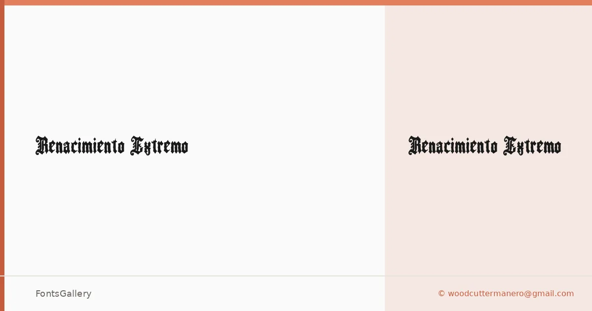
About Renacimiento Extremo Font
There is a rawness to this blackletter that sits somewhere between a medieval woodcut and a contemporary street poster — which is entirely in keeping with Woodcutter Manero's approach. Released under the Woodcutter Manero "Fonts Lab" banner in MMXXIV, it arrives as a single Regular weight in TTF format, its letterforms carrying the kind of deliberate weight and texture that can only come from someone who understands the drama of the gothic hand.
Design Aesthetics & Character Characteristics
The blackletter construction is dense and unapologetically bold, with a grunge-inflected edge that gives it a vintage character without ever feeling like a museum piece. Strokes are heavy, contrast is pronounced, and the overall texture reads as classic yet rough — the sort of type that commands attention in a single line of Latin text. That single Regular cut means every decision in the design has to carry its own weight, and it does.
Recommended Usage & Font Pairing
The face is built for headlines, branding marks, posters, logo lockups, and T-shirt designs — anywhere that a strong, atmospheric statement in Latin script is needed. It pairs well against the clean geometry of Helvetica or Bahnschrift, the editorial warmth of Canela or ABC Arizona, and the structured personality of Etna, any of which give it a counterpoint that keeps compositions from tipping into pure darkness.
License & Usage Terms
Renacimiento Extremo is released under Personal Use terms only — confirm with the designer at [email protected] or http://www.woodcutter.es before deploying it on any commercial job. Embedding is permitted at the installable level.