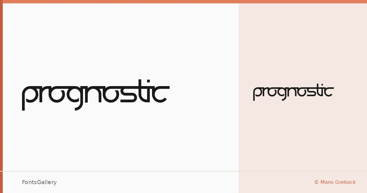
About Prognostic Font
There is something deliberately spare about this display face — each letterform stripped to a geometry that feels less like decoration and more like a signal. It comes from designer Måns Grebäck, and it arrives as a single cut: Regular. The Latin character set is clean and purposeful, with a futuristic tension held in check by minimal construction.
Design Aesthetics & Character Characteristics
This is a display typeface built around a bold, modern sensibility — the kind of weight and presence that commands a headline without relying on ornament. The forms read as futuristic but restrained, sitting closer to the minimal end of that spectrum than the theatrical. Delivered as a TTF in one style, it is a focused tool rather than a system, and that focus is exactly the point.
Recommended Usage & Font Pairing
It earns its place in branding, logo work, poster headlines, and website headers — anywhere Latin-script copy needs to land with authority in a single glance. For body text or supporting type, it pairs well with Helvetica, Bahnschrift, or Times New Roman for contrast, and works alongside Canela or Etna when a more editorial or layered mood is needed.
License & Usage Terms
Prognostic carries Personal Use terms only — commercial use is not permitted under the included license, and embedding is limited to preview and print. Before using this face in any public or commercial context, contact Måns Grebäck directly at [email protected] to arrange the appropriate license.