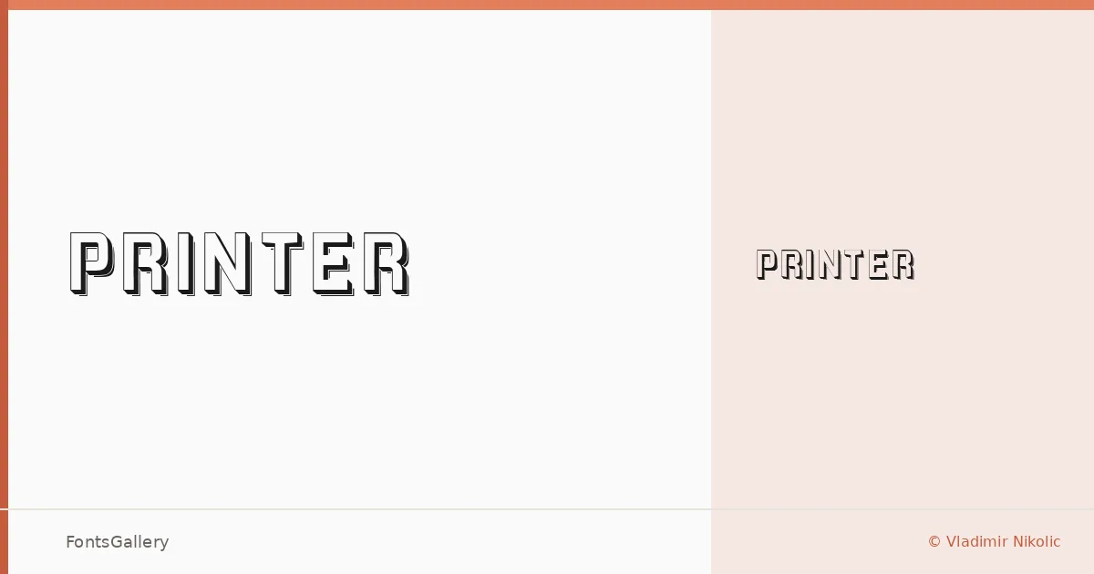
About Printer Font
There is something deliberately worn about this face — the kind of weight and texture that recalls letterpress type pulled from an old bed press, ink slightly bitten into paper. It is the work of Vladimir Nikolic, released under his own name, and it arrives as a single cut: Printer Regular. The forms carry a rugged, mechanical authority that sits somewhere between industrial craft and editorial nostalgia.
Design Aesthetics & Character Characteristics
This is a display typeface in the truest sense — bold, classic in its proportions, and unmistakably rustic in spirit. The single Regular weight delivers in TTF format and covers Latin script. Its vintage character comes through in the texture and density of the strokes, giving headlines and logotypes a sense of age and craft that clean geometric faces simply cannot replicate. It asks to be set large.
Recommended Usage & Font Pairing
The natural territory here is branding, poster work, logo lockups, and T-shirt design — anywhere a headline needs grit and presence rather than polish. Paired against the elegance of Canela or the neutrality of Helvetica or Bahnschrift, it gains contrast and breathing room; alongside Etna or AQUA, the vintage register stays consistent while adding typographic variety to a layout.
License & Usage Terms
This family is offered under Personal Use terms — commercial use is not permitted, so confirm licensing with the designer before taking it into a paying job. Embedding is limited to preview and print only.